Sergey Sapelnyk, founder of Pearly, and his team utilized various insights from Clarity to make necessary changes to their site resulting in an increase of conversion rates by 35%. Here’s how they did it.
Pearly is a DIY bubble tea kit brand that recently launched in January 2022. They are revolutionizing the way consumers drink bubble tea by making it easy to make a tasty bubble tea at home. Their customers are primarily US-based and are bubble tea lovers of all ages. As a newly launched brand and having never used any behavior analytics tool previously, the team set up Clarity right away. Their intention was to understand how consumers were shopping on their website and allow them to think critically about the shopping experience they were providing.
The Challenge
At the start of the launch, they began monitoring all aspects of the website’s performance in order to understand the biggest tension points for their customers with the end goal of increasing conversion rates.
Within a few days, they began uncovering various areas of opportunity through the use of Clarity that were likely leading to drop-offs in conversions, which included:
1. Dead social media links and other minor issues that were only uncovered through reviewing screen recordings
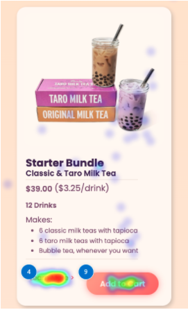
2. Lack of clarity on certain product descriptions and consumers watching more education on the product before
3. High drop-off and lack of scroll below the fold, especially from paid traffic
“Clarity helped identify all of these issues, and enabled us to re-evaluate gaps in the customer experience. Ultimately, we uncovered multiple aspects of our website which were hindering conversions, and not answering key questions that consumers had.”
The Solution
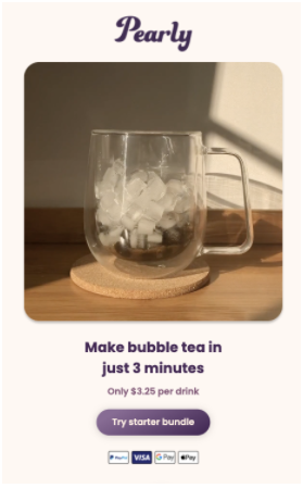
After their findings, Pearly leveraged the insights that they uncovered from Clarity to improve conversion rates of paid traffic visitors. They created a dedicated landing page for paid traffic to drive to which included two major revisions:
1. Adding video above the fold to explain the value proposition quickly in order to mitigate low scroll depth
2. Adding additional sections that explain how the product works on the dedicated landing page and not redirecting users to a separate page
Learn how your customers navigate your site!
Through recordings, heatmaps and much more!
The Results
Much to their surprise, the revised landing page increased Pearly’s conversion rates by 35% – a HUGE improvement in cold traffic conversion rates. The new landing page explained their value proposition and how the product worked quicker than before, improving the overall shopping experience for their customers.
The Learnings
1. Pearly believes that simply watching how your users engage with your website will likely uncover massive opportunities for your business. Screen recordings of a shopping experience are extremely valuable in helping understand your shopper’s psyche, and how you can facilitate their experience and improve conversions.
2. Segmentation of your audience in Clarity is key! Not all visitors to your website will be the same therefore you should orchestrate the shopping experience accordingly. A returning customer should (ideally) not be visiting the same landing page as a cold customer who has never heard of your brand before.
3. Always be testing. There’s always more growth you can unlock, and the smallest improvements to your website can have a substantial impact on your business. Leverage Clarity to closely monitor the results of any tests.

“Clarity is my go-to tool for diagnosing problems across our brand’s website, and for exploring opportunities to increase conversion rates. If you want to improve the customer experience on your website, I highly recommend using Clarity on an ongoing basis.”
– Sergey Sapelnyk, Founder
Love using Clarity? Share your story with us!