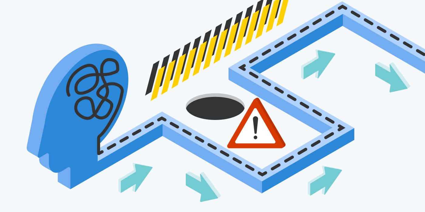
Creating an amazing user experience (UX) can be challenging. If users are frustrated, they will quickly leave your site and visit a competitor.
Everything on your webpage needs a purpose and every element needs to try and satisfy the user. Products that delight in this way will quickly promote adoption, loyalty, and advocacy. The best UX is when users can intuitively complete tasks on your site without even thinking about them. This iterative process is a journey that has no destination.
Today we caught up with Microsoft’s talented designer, Daniela Buitrago to understand how Clarity helps her deliver the right user experience.

Hello Daniela! Thanks for taking the time to speak to us. Could you tell us a little about you, the role of a UX designer, and some fun facts about you?
Hola! I currently work as a designer at Microsoft. My efforts focus on researching and creating digital experiences that aim to bring useful, delightful, and interesting adverts to people when they are using Edge, Bing, or MSN, on mobile or desktop.
As a UX designer, it is my role to empathize with users, define pain points, ideate solutions, test prototypes, iterate, create designs, and start again. It is vital to think of the user experience at every single moment of their journey as they interact with a service or product. It is my job to make it as seamless, immersive, enjoyable, and adaptable as possible.
Some fun facts about me:
- I have a background in Art History.
- My favorite color is yellow.
- I have watched The Lord of the Rings trilogy way too many times.
- I am learning Russian, which is my husband’s first language.
Describe Clarity in one sentence?
Clarity is an easy-to-use tool that gives you valuable insights into how people are interacting with your website.
Describe a heatmap to a first-grader?

Imagine that instead of using text or numbers you can easily give information to someone using color. For example, you have a website with a lot of pictures about your favorite hobby and you want to know what pictures people are looking at the most. A heatmap will tell you this. The redder the image the more popular it is. Other colors like blue are used to show the least popular pictures.
How do you use Clarity for UX?
I use Clarity for a variety of reasons, here are three scenarios:
1. Increase product discoverability
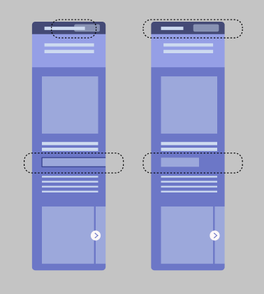
Whilst looking at the Clarity dashboard for a particular project, I noticed a high number of dead clicks. By digging deeper into the session recordings I saw most dead clicks were happening on the image carousel. A high number of dead clicks is a sign of poor user experience.

The carousel had a total of five images but users were trying to find more. By moving the scroll bar and explicitly telling users the total number of images in the carousel I was able to significantly reduce the number of dead clicks on the page and improve the user experience.
2. Improve site navigation
The scroll depth feature is really cool as it lets me see if website visitors are missing key content. Whilst looking at one of our pages I noticed the scroll depth was not far enough for users to see related content on other pages of the website.

To mitigate this I added tabs at the top of the page so users can easily navigate to the content that is important to them. By making this change I saw an increase in the time spent on the site.
3. Building a responsive design
The Clarity dashboard makes it easy for you to see how many of your visitors are using a mobile device. By filtering by mobile and watching session recordings I was able to see that some of our header elements were not responsive to small screen sizes. Thus causing a poor mobile user experience.
Thanks to Clarity I was able to share this insight with the engineering team to make the necessary changes and fix the error.
How do you measure success?
For our team, success is measured if we achieve both business goals and user experience goals. In general terms, we can say that we succeed if we:
- See an increase in our click-through rate.
- Increase the number of users.
- Increase time spent on the site.
This data is easy to capture using Clarity and by using filters you can see how the site performs through time. However, it is very important to remember other user experience metrics, such as happiness, engagement, adoption, retention, and task success. Using Clarity you can evaluate to see if you achieve success in areas like retention or task success.
As a UX designer, you constantly need to connect with users so you can design with their needs in mind and consequently create solutions that are useful, interesting, and entertaining.
Why would a UX designer use Clarity?
A UX designer will use Clarity to support their design decisions. Information is powerful, and precise information is even more. Instead of shooting in the dark, you can use Clarity to make thoughtful decisions that will most likely bring positive results.