You know what they say, ‘you never get a second chance to make a first impression.’ And let’s be real, your landing page is basically the online equivalent of a blind date. So, if you want to make sure you get that second date (or in this case, convert that visitor into a customer), you better make sure your landing page is on point. But don’t worry, we’ve got your back. Whether you’re a landing page newbie or a seasoned pro, our guide will show you how to create a page that will make visitors swoon (or at least, click that “buy” button).
Here are some tips on how to optimize your landing page for conversions:
Understand Your Target Audience
First things first, you need to figure out who you’re trying to impress with your landing page. Are they cat lovers? Fitness enthusiasts? People who can’t resist a good pun? Once you know your audience, you can tailor your page to speak directly to their interests and pain points.
Have a Clear and Compelling Headline
Just like a dating profile, your headline is the first thing people will see, so it better be good. Make sure it’s clear, concise, and communicates the main benefit of your product or service. Bonus points if you can work in a clever pun or pop culture reference.
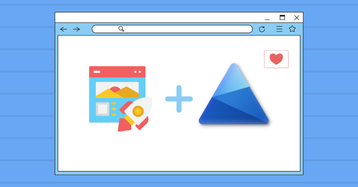
Use an Attention-Grabbing Hero Image or Video
A picture is worth a thousand words, so make sure your hero image or video is visually stunning and communicates what your product or service is all about. Think of it like a dating profile picture, you want to make sure it’s a good representation of what’s to come.
Explain the Benefits of Your Product or Service
Once you’ve caught their eye, you need to convince them that you’re worth their time. Use clear and concise language to explain the benefits of your product or service, and make it easy for visitors to understand how it can help them. Think of it like a dating profile bio, you want to highlight your best qualities.
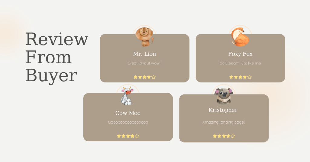
Include Social Proof
Social proof, such as customer testimonials or trust badges, can help build credibility and demonstrate that other people have had success with your product or service. Think of it like having a wingman, it makes you look more attractive by association.
Use a Strong Call-to-Action
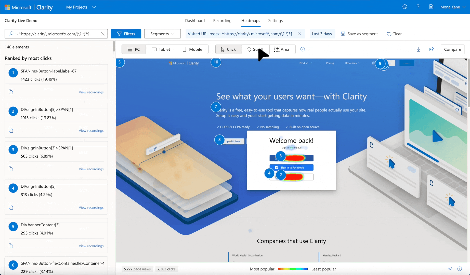
A call-to-action (CTA) is like asking for a phone number or a date. It should be clear, concise, and easy to find. A strong CTA will make it easy for visitors to take action, such as “Buy Now” or “Sign Up.” To optimize your CTA, you can use Microsoft Clarity’s heatmaps and session recordings to see how your users engage or don’t engage with your CTA. If you see your users gravitating to another part of the website in your recordings, then this is a prime opportunity to add a CTA in that area.
Keep the Landing Page Easy to Navigate
You don’t want your visitor (or date) to get lost or frustrated trying to find what they’re looking for. Ensure your landing page is easy to navigate, and all the important information is easy to find. Use Microsoft Clarity to find pain points within your UX design with heatmaps and session recordings to improve your customer’s experience.
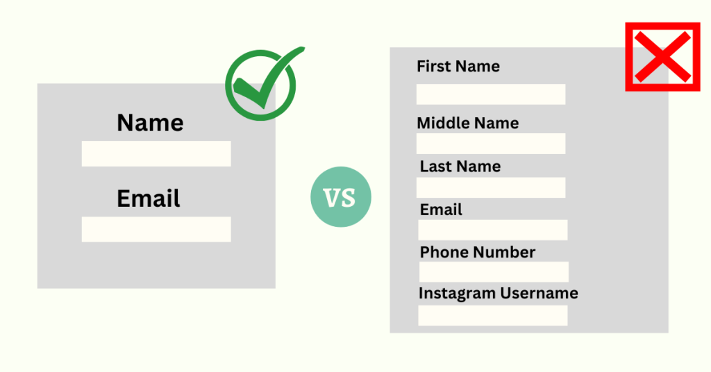
Keep the Form Fields to a Minimum
Nobody likes filling out a long and tedious survey, so make sure you only ask for the information that you absolutely need.
Make Sure the Page is Mobile-Friendly
With the rise of mobile devices, your landing page must be mobile-friendly. This means that the page should be optimized for small screens and should load quickly on a mobile device.
Optimize for Conversions Using Microsoft Clarity
Microsoft Clarity can help you understand how visitors interact with your website, and provide detailed information on user behavior. This data can be used to identify areas of your landing page that are causing confusion or friction for visitors, which can negatively impact your conversion rate.
Continuously Test and Optimize
Just like in dating, you need to put in the time and effort to make it work. Continuously test different elements of your landing page, such as the headline, images, and CTA, to see what works best and optimize accordingly.
Maintain Consistency
Finally, make sure that your landing page is consistent with your overall branding and messaging. You don’t want to confuse your visitor by being one thing online and another in person. That would be the equivalent of catfishing in the dating realm, and nobody is trying to get catfished.
Well folks, there you have it. All the tips and tricks you need to create a landing page that will have visitors falling head over heels (or at least, clicking that “buy” button). But remember, just like in dating, creating the perfect landing page takes time and effort. So don’t get discouraged if it takes a few tries to get it just right. And who knows, with a little bit of TLC (and some help from Clarity), your landing page might just become the envy of all your competitors. Happy converting!