
Do you need more subscribers? Want to entice your visitor to purchase your product or service? Do you want to persuade your visitor to try your offering? Then you need to make sure your website has a compelling CTA!
The acronym, CTA stands for call-to-action which is defined as a stimulus to do something in order to achieve an aim. Call-to-actions predate the internet and have been included on flyers and brochures for years e.g., Call 1-800 000 000 today for more information.
On a website a call-to-action is normally displayed in 3 ways:
Text hyperlink

Button
Plain text with no link

It is the part of your website that encourages the visitor to do something such as “signup” or “buy now”. CTAs drive many possibilities depending on your goals but are mainly used to help drive conversion for your business. A compelling CTA will bring you one step closer to your website objectives.
When writing a CTA, you need to know your objective. Top of the funnel when driving awareness could be “Learn More”. Whereas bottom of the funnel when looking to convert could be “Buy Now”.
CTA: Important things to consider
Devices
CTAs are rendered differently on different form factors, care should be taken so that they don’t show up incorrectly on mobile.
Example: CSS error

The user will find the above confusing as the user does not know where to click or tap.
CTA Color
Choose a color that stands out on your page. A contrasting color will work best to draw the visitor’s eye to the CTA. If you are not sure which color to use, then a/b testing can help here.
Example: Accepting cookies
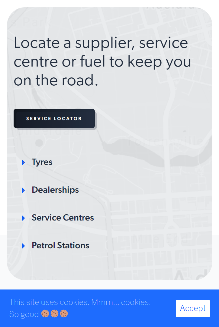
The example shows a clear contrasting color making it easy for the visitor to accept or continue browsing as the call-to-action is taking up the right amount of real estate.
Placement
This is very important as your CTA needs to align with the rest of your messaging and be relevant. You must remember that you are taking the visitor on a journey and it is the conclusion of that journey. A call-to-action should not make it hard for the user to do anything else. If the CTA is a modal window and does not go away when the user clicks outside it, then the result will be dead clicks and a poor experience.
Example: Sign-up for marketing emails and get 30% off
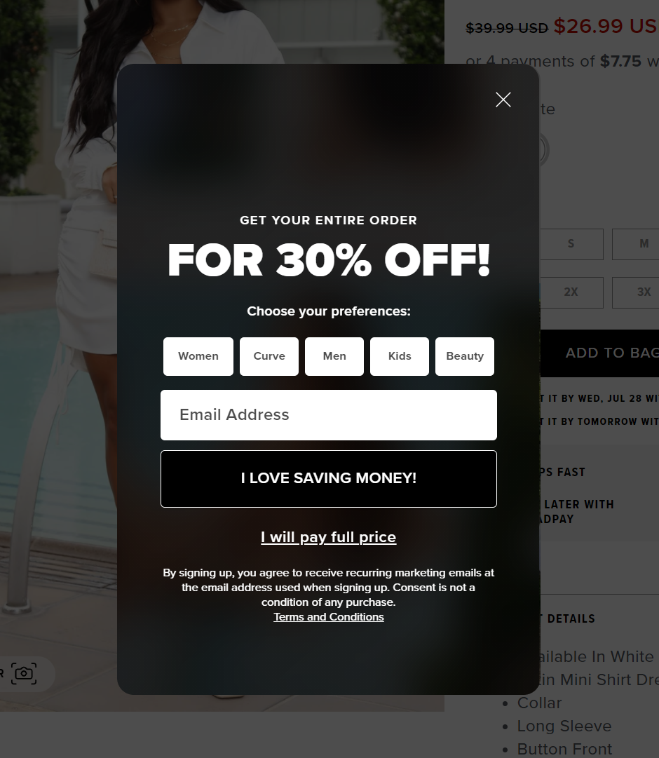
The above CTA causes dead clicks and frustration as the visitor cannot bypass the CTA unless they complete an action. The site has also made it harder to dismiss the CTA the user forced to click on “I Will Pay Full Price!”
Incentive
Give the reader an incentive to complete your CTA by giving them an offer such as a discount or gift with purchase. Using Clarity’s session recordings feature you can see which CTA is working and where there might be errors.
Example: Download the app and receive a discount on the first purchase
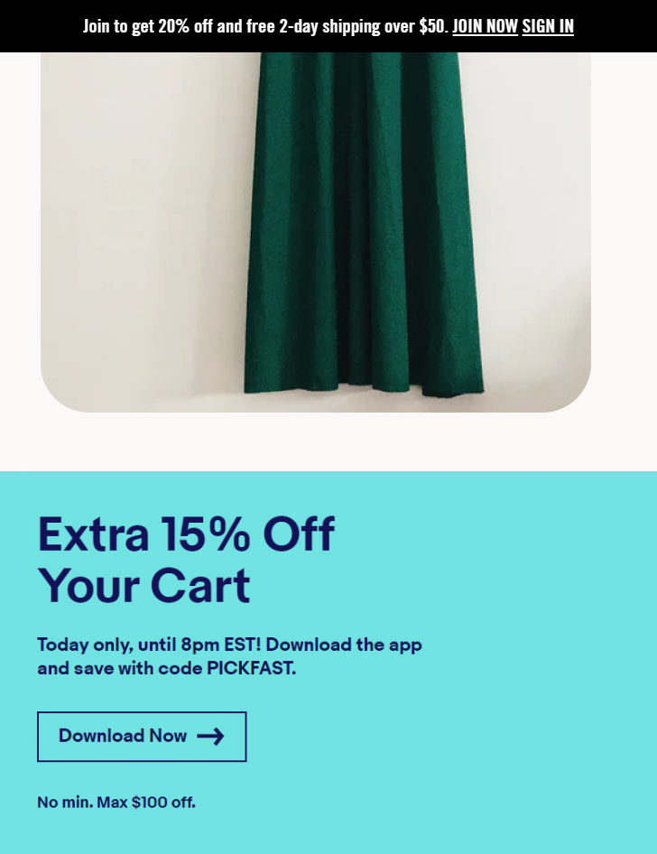
The above example is clear and the user understands what will be the result of downloading the app. Also, it isn’t intrusive to the browsing experience and can be easily accepted or dismissed.
Instruction
Be clear with what do you want the user to do i.e., Click the button below.
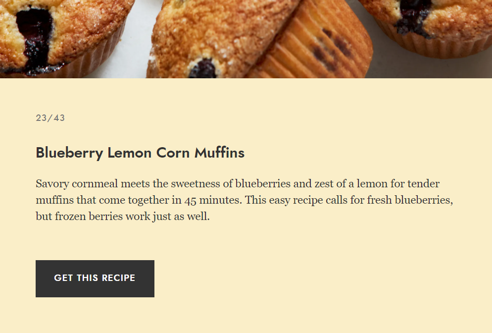
Example: Discover More

The above CTA is clear to the visitor. By clicking on ‘Discover More’ they will get more information about the product.
Get Clarity and test your CTA!
The best way to understand which CTAs are delivering your objectives is to test them. Once you know which ones are working you can use them going forward to meet your goals.
A great way to test your CTAs is by using a user behavior tool such as Clarity
With Clarity you will be able to get actionable insight and see:
- How far visitors are scrolling – Can your CTA be seen?
- Where are visitors clicking – Is the CTA working?
With that data, you will be able to optimize your CTAs to improve your metrics and get the results you want!
Get that click, make your CTA slick! Get Clarity today!