During our birthday celebrations, we thought it only right to give our customers a feature they really wanted! Introducing – Area maps!
So, what exactly are Area maps?
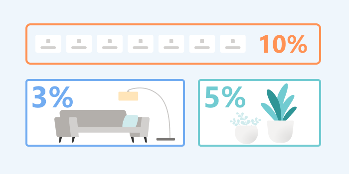
Area map is a new type of heatmap that shows you the total clicks for all the elements within a selected area you choose.
We show this in 2 ways:
- First by color
- Second by percentage
This makes it very easy to see if the right elements on your page are getting the desired attention.
How does this differ to a Click map?
A Click map shows you where users clicked on the page using coordinates on the x-axis and y-axis. Whereas an Area map shows the total clicks for all the elements within an area you choose. We wanted to make it easier for our customers to choose areas they care about and aggregate the clicks for all elements within it.
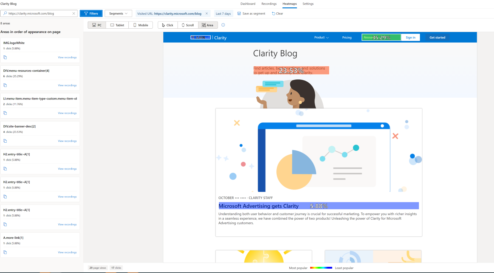
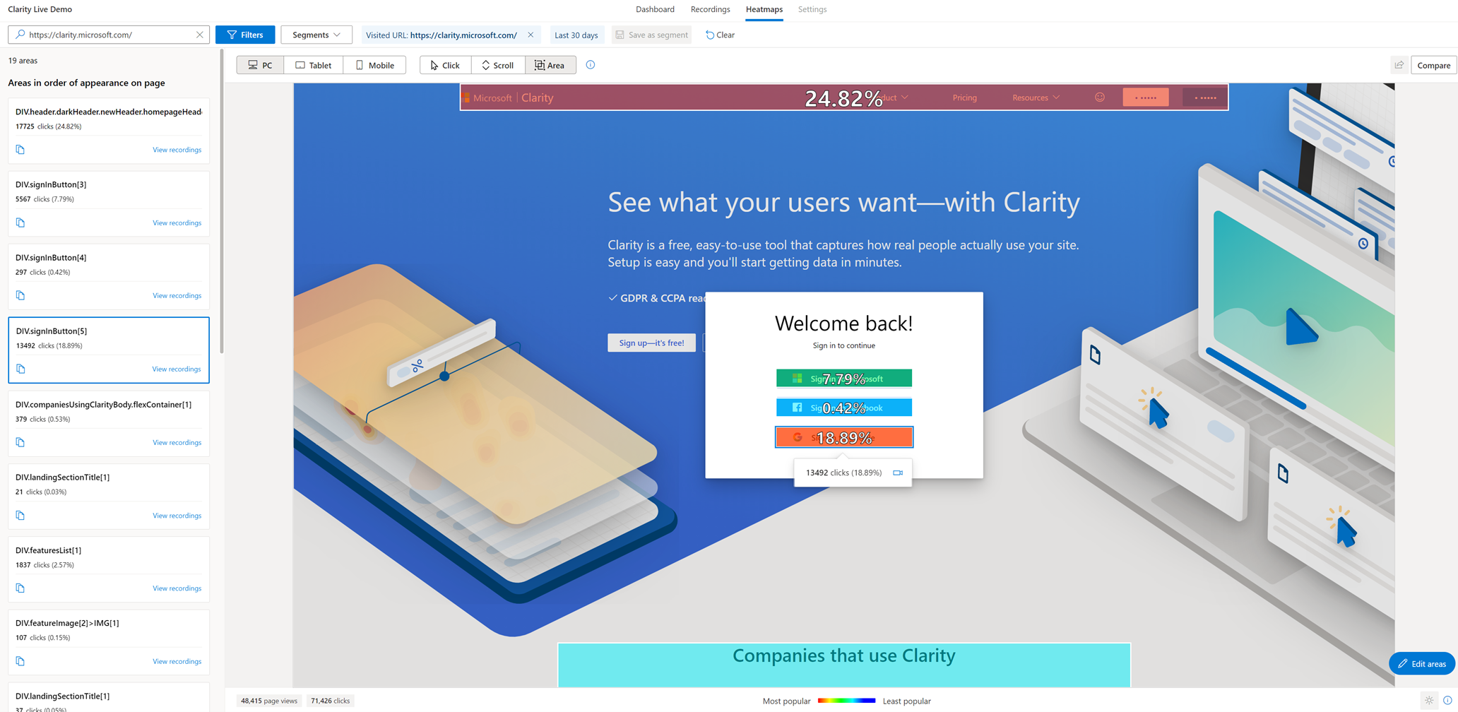
Let’s take a look at an example
The image below shows our homepage.
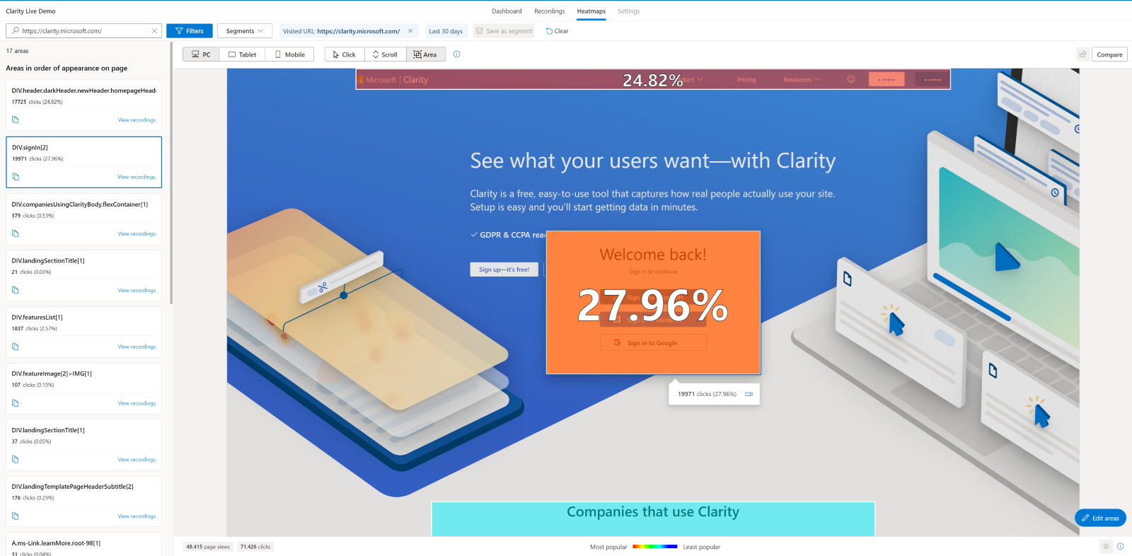
We can easily see that across the last 30 days nearly 28% of visitors have gone to complete the sign-in process. That’s excellent information for sure!
But what if we wanted to dig deeper and see which sign-in method has been the most popular?
Easy, we can select edit area and drill down to each sign-in element.
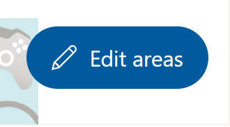
We can now see which of the given sign-in options is the most popular!
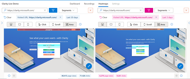
Digging even further, in the future we could AB test different orders using our upcoming new feature, heatmap compare to see if changing the order has any impact on customer behavior.
So there you go! Area maps are here! We are pretty sure this will become a firm favorite with customers.