Blog #1 in the series: How to become a Clarity power user
About the author
Josh Silverbauer is a highly accomplished analytics and conversion rate optimization (CRO) expert, known for his ability to combine complex analytics concepts with music & humor…With over 10 years of experience, he has consulted with some of the world’s largest brands, and has spoken at major events like SXSW & MeasureSummit. Josh is currently the Head of Analytics and CRO at From The Future, a CX & performance growth agency, and previously served as CEO of Great Big Digital Agency for 6 years.
Why Simple is Better
Doesn’t it feel like digital analytics is going in the opposite direction of the rest of technology? Everything is getting simpler, but digital analytics is getting more complicated, technical, and kinda blah. Sure, if you like torture you can sit for hours playing with SQL and looking at numbers in tables until your brain explodes, but shouldn’t there be an easier way? Making something complicated requires little thought, but creating something that is simple, yet powerful is incredibly difficult. So why invest time and resources into simple? Well, simple is better.
1. It’s easier to understand

I have a toddler, and my toddler loves to continually come back to mac and cheese every night. He knows that he will like mac and cheese. He likes the presentation of mac and cheese. Mac and cheese is digestible, delicious and dependable. You can even throw some peas in and he’ll be fine with it. The point? If you take a bunch of data and put it into a format that is digestible and easy to understand, it will get eaten (ahem…used)
2. It’s actionable

In my 10 year career, I’d like to say that most likely about 75% of the data that I’ve architected and implemented has gone unused (and that’s being generous). Why? Because people want to feel like they are being data-driven, so they ask for all sorts of data that they will never really use or understand. People have a vision for what they think they can do with data but then once put into practice, they find themselves confused by how to use it. Clarity provides the most streamlined, straightforward display of data that I’ve seen. The data is displayed directly on your website. You can see it at the heart of where the actions are happening. It gets to the point, and gets there quickly, and even if you need a little help, there’s AI right alongside to help you turn questions into action.
3. It’s so much less time-consuming

Getting stuck in analysis paralysis is one of the most wasteful activities one can do in business. Identifying trends quickly can lead to adaptation, agile thinking, and quick action which can create major opportunities.
4. Simple analytics lead to better optimizations

Simple analytics help you focus on the metrics that matter, enabling you to identify opportunities quickly. This simplicity accelerates your ability to gain insights, which in turn allows you to take action and improve your website’s user experience. An enhanced user experience can lead to increased purchases, leads, and conversions, directly contributing to the success of your business. The better your business does, the more money you will make. The more money you make, the more everyone will say “dang, look at that money-makin’ king/queen right there, that one’s got it goin on.” (and that’s the goal right?)
Clarity’s Core Features: Simple Design, Major Impact

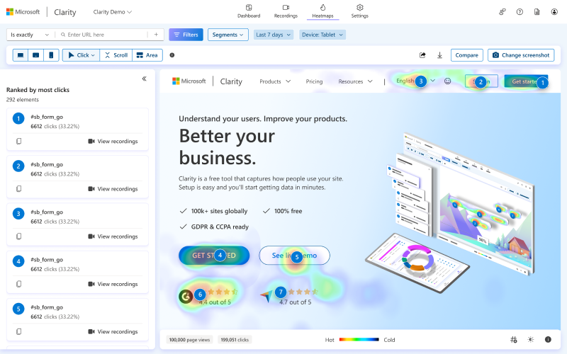
Clarity is best known for its Heatmaps and Session Recording features. But within each one of those, there are hundreds of ways to slice and dice the data.
Say you wanted to see a heatmap of only people who converted, or compare two different landing pages to determine which one had a greater impact on a conversion action that happened on a completely different page. Yeah, you can do that. Or how about if you want to understand which elements specific channels interact with on their pathway to conversions, yeah, Clarity can do that too. Or what if you wanted to see which caused the most friction during a user’s pathway through the site…Clarity?…yep! And if you want to see these features in action, you’re in luck because, over the next few months, I’ll be releasing more blogs on how to get the most out of Clarity.
What makes Clarity standout?
How does all of this compare to other heat mapping & session recording tools on the market?
- Clarity is free – nuff said.
- Clarity has a beautiful design and UX that isn’t overly complicated and crowded by a billion unimportant features. It’s clean, user friendly and gets to the point.
- Clarity has AI capabilities that ARE SUPER FRICKIN COOL YO.
Wow, you seem very passionate about those AI features Josh. Yeah, that’s because they are revolutionary.
It’s not often you get the heart of a startup within the midst of a major organization like Microsoft. Clarity is special like that. The group who breathes life into Clarity are pouring their soul into the product but the resources they get to pull from are BIG.
Here are some of the top features where Clarity really shines.
CoPilot

With a single click, Clarity has the ability to analyze hundreds of aggregate session recordings and output meaningful insights. You can filter by any criteria (i.e. people who converted, people who abandoned, returning purchasers, etc), then select their sessions and uncover any commonalities between them. It can even summarize entire heatmaps in a single click including any filters you want. Talk about time-saving insights.
Customization Options

Beyond the AI, Clarity has the ability to be incredibly customizable. For instance, if you ARE the type of person who wants to configure every itty bitty thing yourself and not rely on the beauty of simplicity (which is totally fine…you do you), there are custom tags! Custom tags allow you to tag any type of event and ultimately build segments that you can filter down by based on your own criteria. So for instance if you’d like to understand how your logged in users are navigating the site or a page vs your non-logged in customers…you could tag the login event and have the ability to segment the users by whether they are an existing customer (though there’s a native smart event now for that too).
OR how about if you want to understand users’ pathways who answered a specific way on a quiz that was displayed, or a newsletter signup. All of this (and more) can be done with custom tags. Or even if you want to tag when someone looks at a picture of spinach on your site for 15 mins…that’s doable in Clarity…and maybe Copilot could help you figure out why they are doing that.
This feature also allows you to see A/B landing page tests in Clarity by configuring events based on the landing page variation that was shown.
Conversion maps

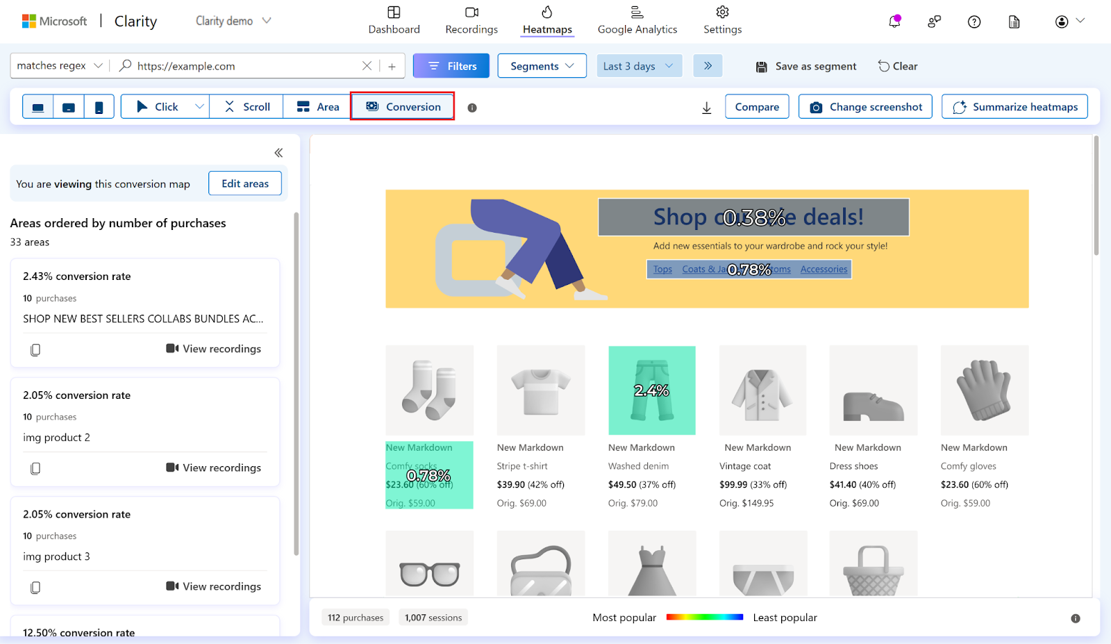
One of the most powerful features that doesn’t get enough credit is Clarity’s conversion maps. This feature has the ability to rank elements based on how much it was clicked in relation to a purchase. There have been countless times that I’ve interacted with clients who want to know how their content/widgets end up leading to purchase. A lot of time is spent building these features and as with anything, time is money, so wouldn’t it be super useful to actually see how your time is equating to money and where to focus your efforts?
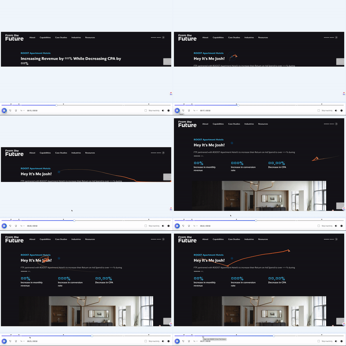
Clarity is one of the absolute best tools to quickly assess where to focus your energy on your website. It’s a super important experience analytics platform and it should be in every marketer’s analytics toolbelt. I happen to know that there are so many amazing things on the horizon for them as well. Do yourself a favor and add Microsoft Clarity. And then invite me to your website. Then I’ll say hi and you can watch it in a session recording.

