
HelloPrenup
Learn how they leveraged Clarity to see a 32% increase in revenue from the previous month.
Who is HelloPrenup?
Sarabeth Jaffe, CTO & Co-Founder of HelloPrenup, used Microsoft Clarity to help guide the overhaul of their software’s User Experience. Here’s what she discovered by leveraging Clarity’s tools.
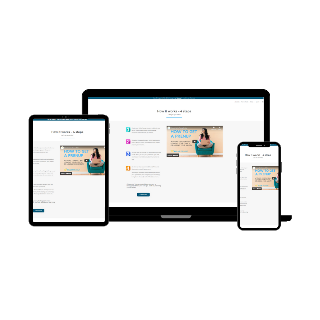
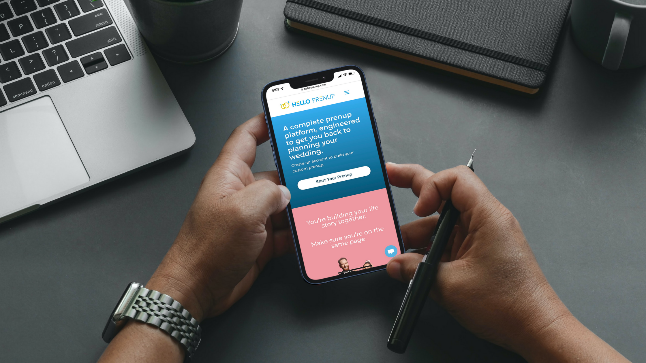
HelloPrenup is an online platform that allows engaged couples to collaboratively create their own prenuptial agreement without the use of attorneys. Requests for prenups have increased 500% over the last 20 years, as today’s brides and grooms have become more financially savvy.
Like most startups, HelloPrenup’s initial goal was to increase their customer checkout rate, but found many notable improvements along the way.

Lacking Clarity
Before adding Microsoft Clarity to HelloPrenup’s software stack, HelloPrenup used a free tier of the popular “experience analytics software,” FullStory. However, after gaining user traction and hitting the maximum allotted sessions per month, the team inquired about and were priced out of the Business level tier. HelloPrenup began to look for alternative solutions that would fit better with their startup budget.
That is when Sarabeth came across Microsoft Clarity. Onboarding to Clarity’s tool was easy, fast, and best of all–completely free. With no cap on session counts, she was able to add it to their public WordPress website and software application.
Learn how your customers navigate your site!
Through recordings, heatmaps and much more!

HelloPrenup’s Challenge
As the first legal tech platform of its kind, HelloPrenup had many questions to consider with limited resources and team size, but focused on the immediate and the near future with two questions…
1. What are the user’s active pain points?
2. How can we create a seamless, enjoyable experience for a complicated topic?
How did Clarity help?
1. User Pain Points
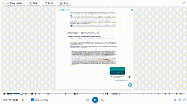
Sarabeth explained, “We are in constant contact with HelloPrenup users via our embedded chat system. Customers are able to easily message us if they have any questions about the platform.” So, Sarabeth was surprised to uncover some hidden points of confusion in the software by viewing Clarity’s “Rage Clicks“.
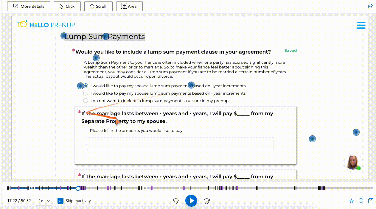
“It’s important to understand what is an input and what is not. We had no idea until we looked into our “rage clicks” that the way we phrased one of our questions was causing confusion,” says Jaffe.
Another simple fix– users were unsure which inputs were enabled or disabled in their financial disclosures section. They opted to re-order the input fields and hide the disabled field until there was a calculated value.
2. Creating a Seamless Experience
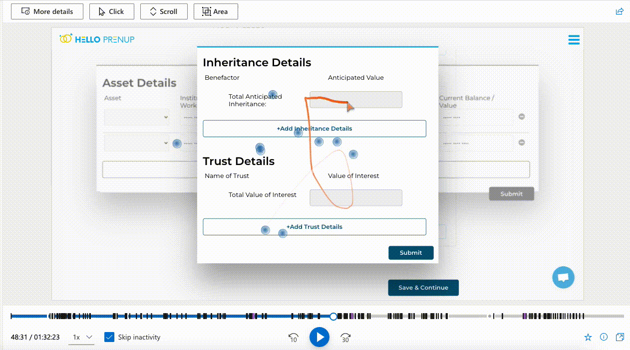
After watching countless anonymous Session Recordings the team knew what had to be done. It was time to make the platform not only comprehensive, but engaging, and fun.
“Legal jargon is not easy to understand, we admit. Clarity’s ability to watch users process information by seeing what they highlight and mouse-over put a fire under our team to really prioritize our copywriting,” Sarabeth explains.
Combining heatmaps and mouse tracking to detect what parts of the questions users were struggling with, they were able to significantly reduce the wordiness of many of their questions.
3. Scrolling Depth
“One of Clarity’s unique features is that it keeps track of “scroll depth” for each page. We were surprised to find that there was more scroll depth drop off in our Desktop users versus Mobile users. That lead us to believe that we still have significant work to do with improving User Experience on large screens, too.”
HelloPrenup plans to restructure the content and interactions by moving most of it above the fold for all device sizes.
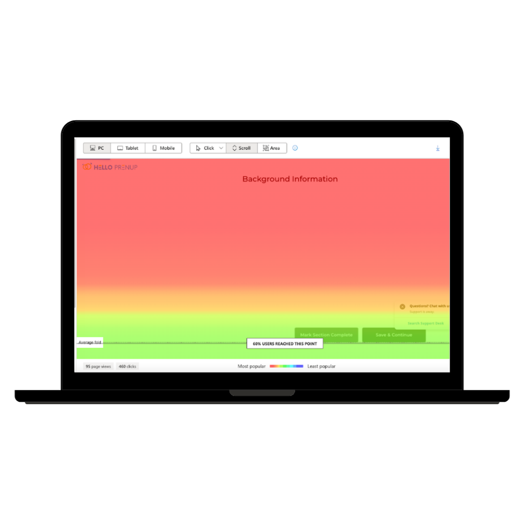
Scroll Map from PC users 
Scroll Map from Mobile users

Outcomes & Shareable Learnings
Uncovered and improved
3 hidden UX bugs that frustrated users
Pending a UX overhaul
For the layout of their questionnaire (less scrolling, more visual components, expandable explanations)
Improvements
To explanations and copywriting
32% increase in revenue
From the previous month
01
Be very clear about what is an input element and what is simply text.
02
Keep your copywriting clear and concise. People don’t like parsing text and they really don’t like scrolling.
03
Customers will tell you about big issues with your software but they won’t tell you those minor UX inconveniences.
04
The screen real estate “above the fold” is critical and it’s oftentimes the only content your user will see.
I use Clarity to plan out our software and design work. By leveraging heatmaps, scroll depth, and mouse movements, I can see exactly what is resonating with and what is overwhelming our users.
– Sarabeth Jaffe, CTO & Co-Founder of HelloPrenup
Love using Clarity? Share your story with us!