Since the launch of Clarity last year we have successfully onboarded thousands of online businesses from small stores to major retailers. During this time we have noticed that some sites are better at sales conversion than others thanks to their purchase funnel.
From this learning, we have identified many ways that you can optimize the design of your online store to streamline your purchase funnel. Every minor improvement that impacts your customer adds up, with no change being too small when it comes to streamlining your purchase funnel and boosting conversion.
Try it out today and optimize your purchase funnel!
Your purchase funnel
Barriers to entry on your virtual store are a lot lower than a physical store however, conversion rates are also lower as it is just as easy to leave. In addition to this, customers visiting your online store can be easily distracted often doing multiple tasks whilst browsing. Without a doubt, this distraction and ability to leave easily gives sales conversion rates at around 2-3%, and on smartphones, it is even lower. As a result of our analysis, we have seen conversion rates for online stores vary from under 1% to as high as 8%.
A well-designed site lets visitors pass through the purchase funnel smoothly and complete the transaction quickly. Optimizing the design of your online store, especially the purchase funnel is vital. Therefore it can have a significant impact on your bottom line.
Product page – the start of the purchase funnel
Product pages are found at the beginning of the funnel. A good product page needs to provide information about the product, images, specifications, and reviews. It should easily allow the user to add the product they are currently viewing to their cart or shopping bag.
Unfortunately, product pages contain a lot of information and so they can often be overwhelming and distracting. Remember that a good product page is designed with the end goal in mind. This should be to encourage the user to take that next step and add it to the cart. At the same time showing relevant product information, even on smaller form factors like smartphones.
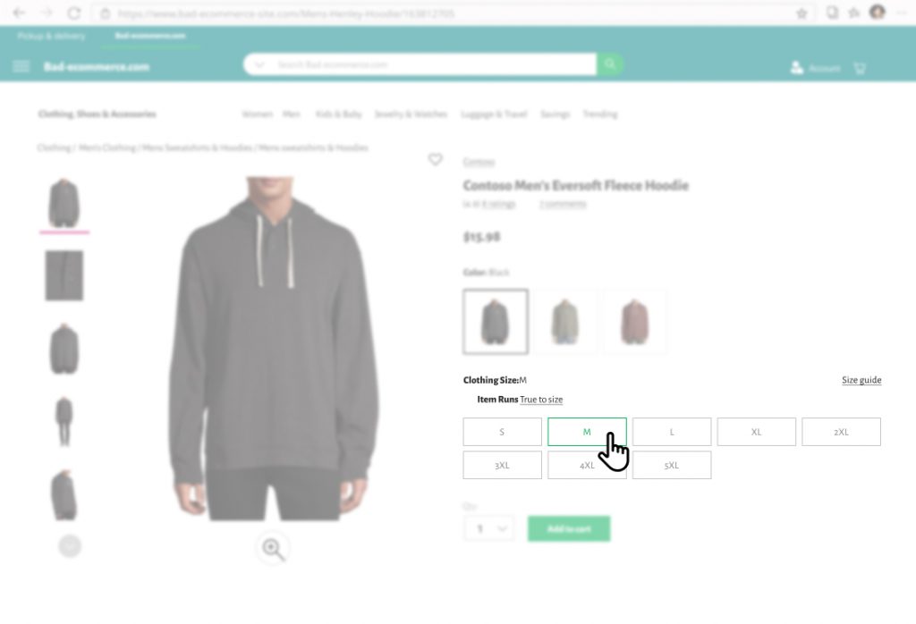
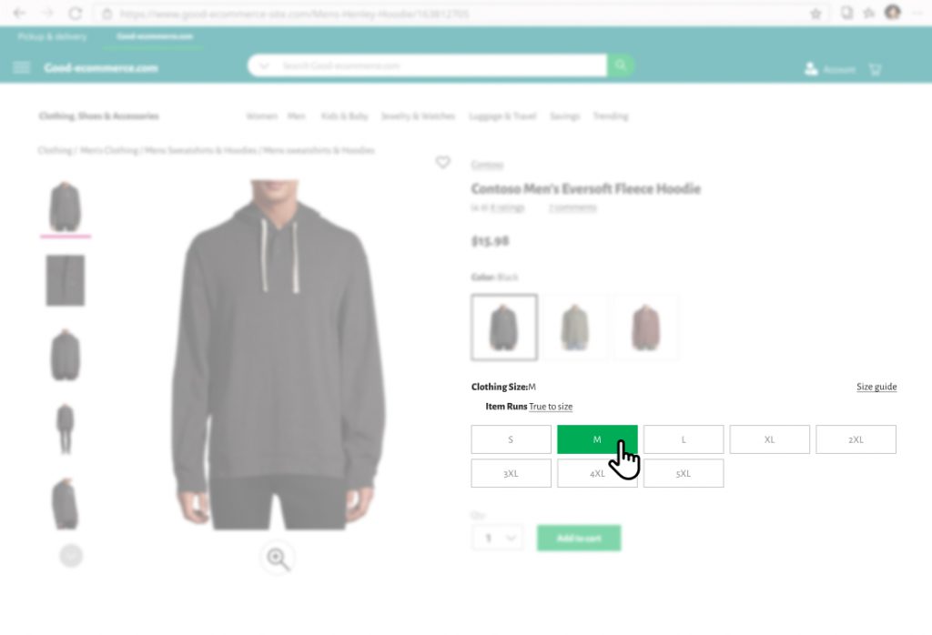
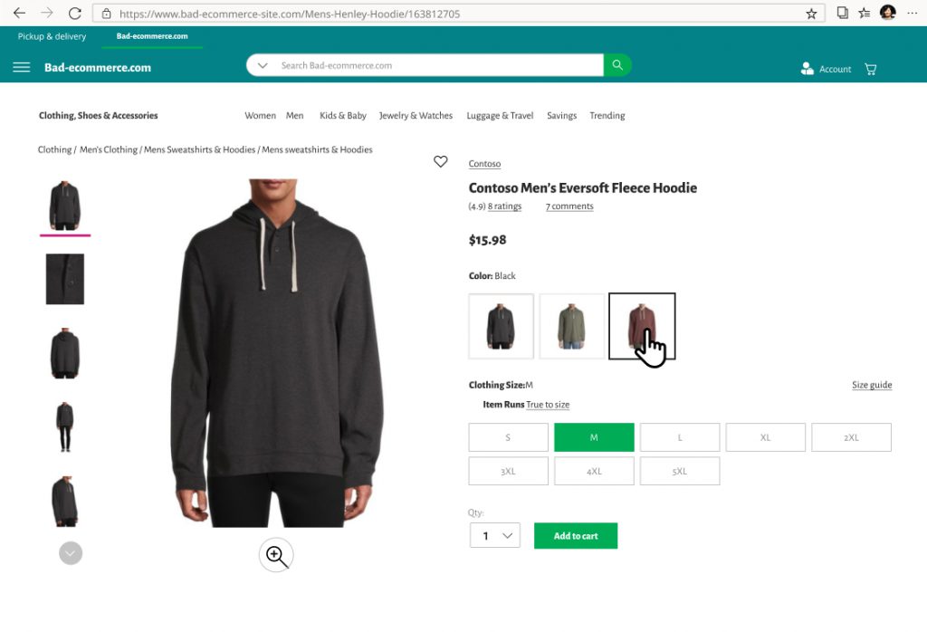
Additionally, users need to select the right size, and, the product color before they add it to their cart. A well-designed product page makes it very easy to select the right product features.
Below we compare the bad vs good examples of product pages (curated from real online stores on clarity).
The right size
Bad Example
Good Example
The color trap
Bad Example
Good Example

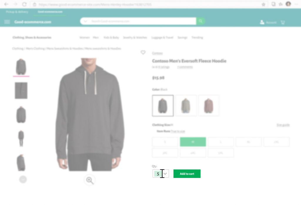
The right quantity
Bad Example
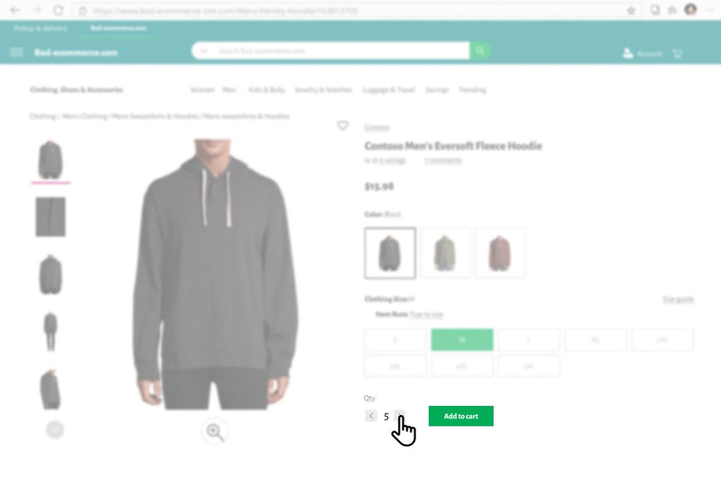
Good Example
The cart page
The cart page is where a user can see all the products they have selected for purchase.
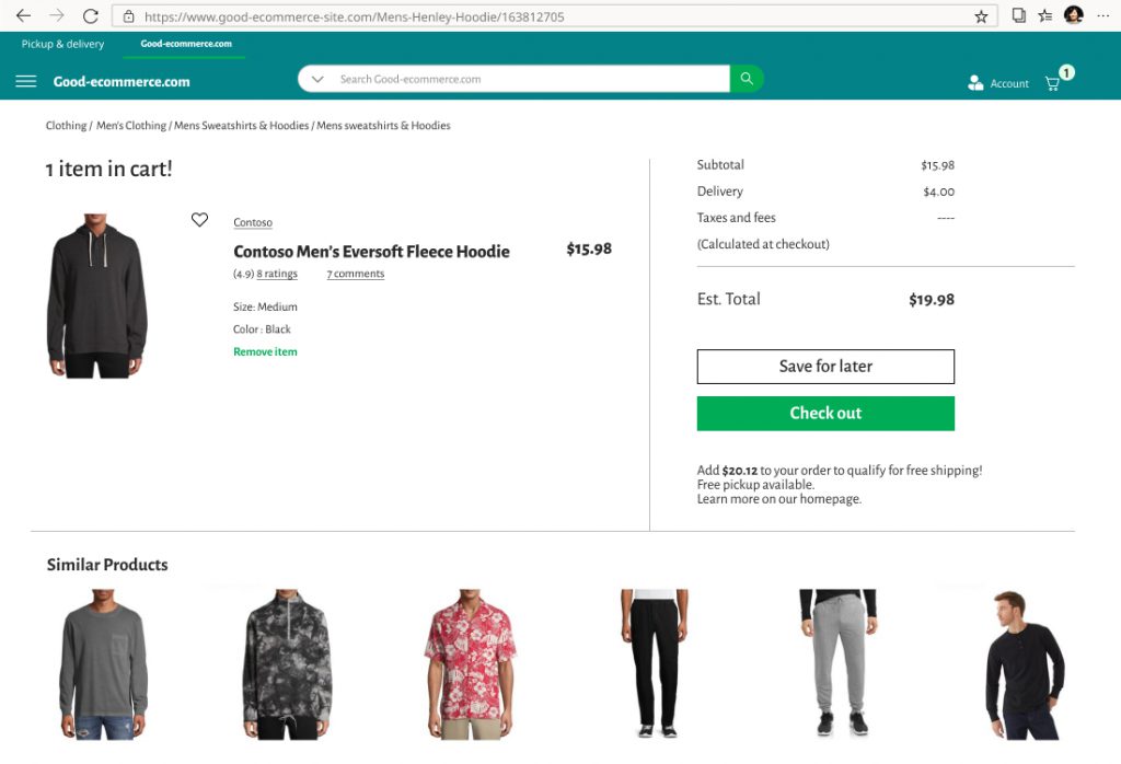
A cart page should make it clear to the user what the next step is: checkout (ideally above the fold). Users are usually distracted when doing things online and your cart page should be clear and deliberate. It should not take attention away from the purchase.
Avoid any links and information that don’t lead the user to the goal of proceeding to the checkout phase of the purchase funnel.
We have seen many sites with lots of dead clicks on their cart pages. This happens when the user clicks on an item that is already in the cart. We surmise that after adding the product to the cart, some users want to go back to the product page to learn more about it, change color/size or continue shipping.
It should be straightforward for users to increase the quantity and a well-built cart should have simple controls. They should let you change the quantity without having to return to the product page.
Bad Example
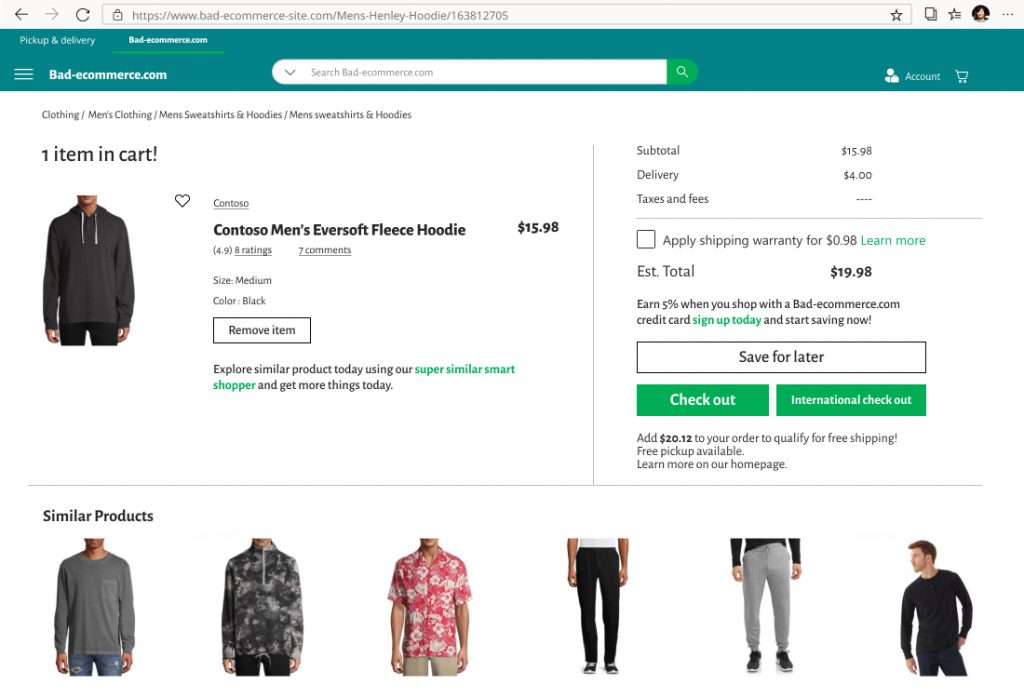
Good Example
Checkout page
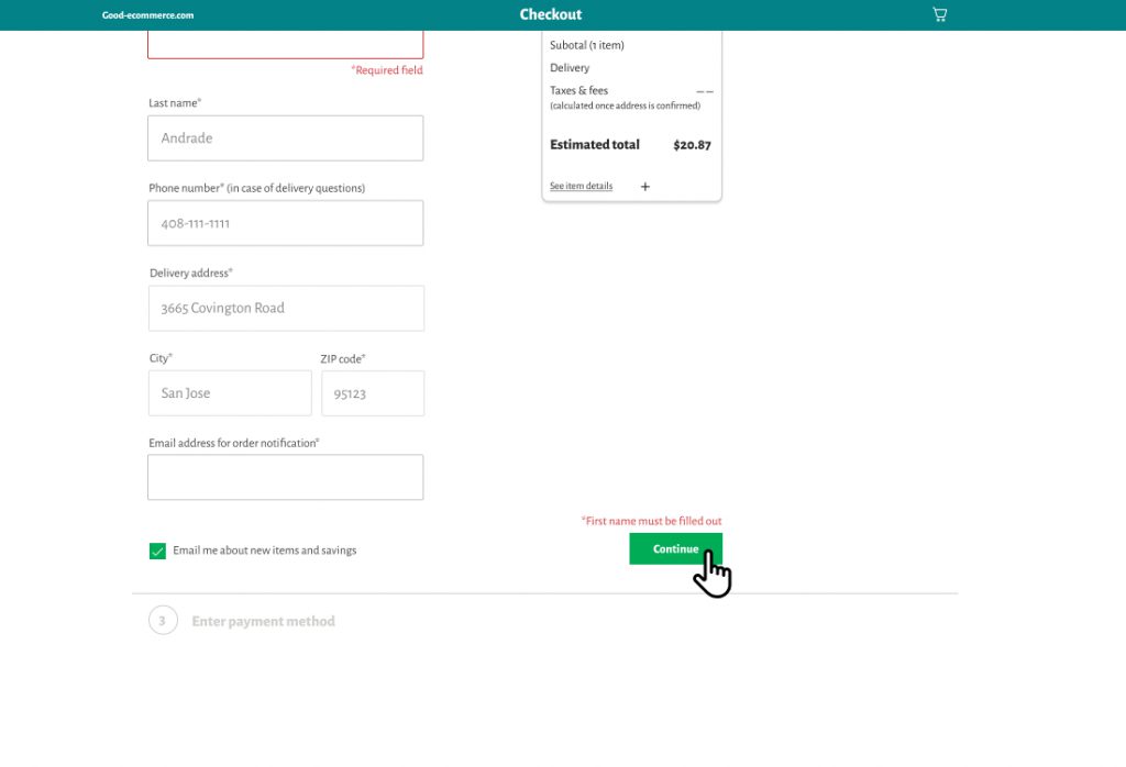
Checkout pages arguably have the most friction of any page on an online store. This is where the customer needs to provide a lot of information and as we all know filling out forms online is one of the most painful experiences on the web, especially on smartphones.
The majority of sales at an online store are made by first-time users providing a lot of information about themselves before the purchase is complete. Each new field creates an opportunity for the wrong information to be entered with errors needing correction before the user can move forward. Consequently, the best-designed checkout pages ask the user for information that is essential for completing the purchase and nothing more. When errors occur, clear messaging directs the user’s attention to the information that was skipped or needs to be corrected.
Bad Example
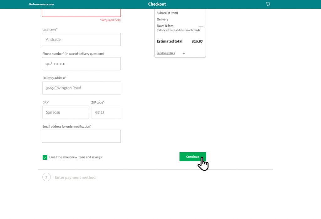
Good Example
How to use Clarity to streamline your purchase funnel
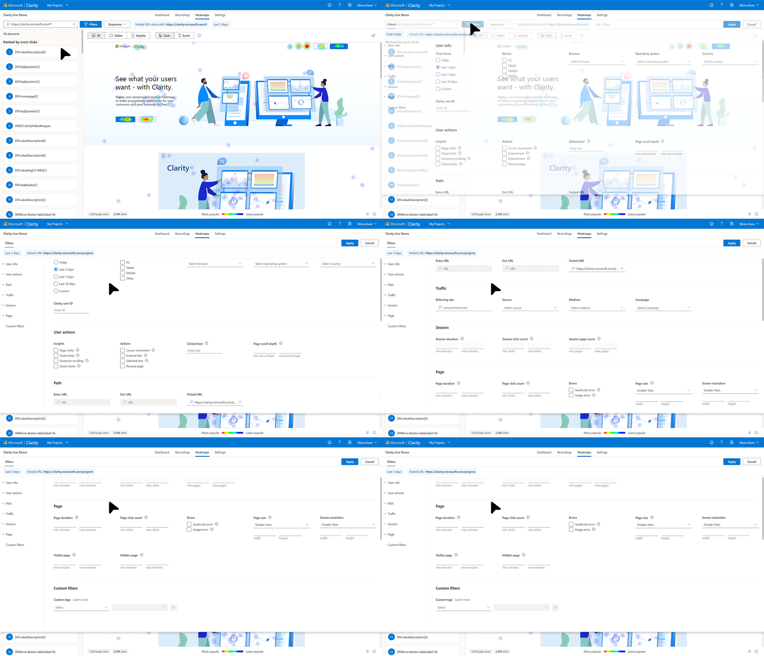
We recommend that you begin by identifying the steps that make up the purchase funnel on your site. Clarity’s filters pane can help you isolate user sessions that reached a particular step in your purchase funnel. The following image shows how you can use the filters page to only see the insights and playbacks for all sessions where the user visited the cart page and came to your site from Facebook using an iOS tablet.
Once the dashboard has been filtered down to a session(s) that include a specific page in the purchase funnel, you can find many signals that can be used to identify friction in the purchase funnel. The following figure shows common signals to look out for when identifying friction in the purchase funnel.
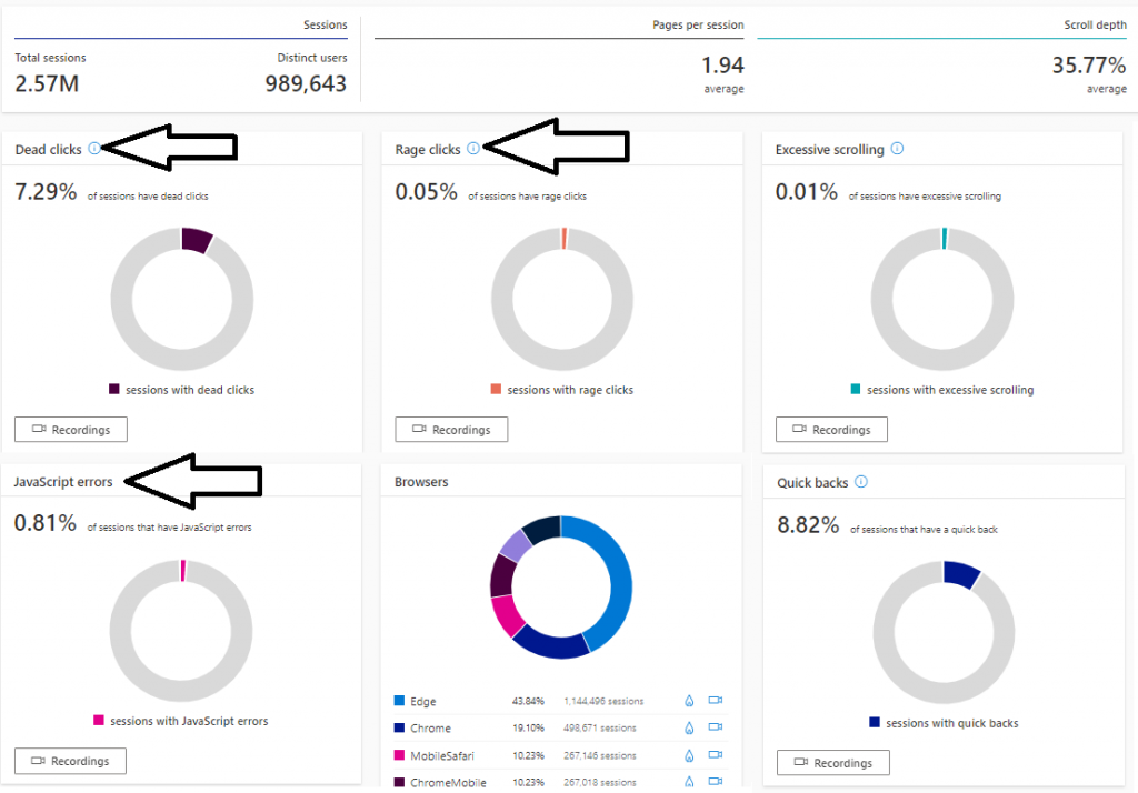
- Dead clicks: clicks on a page that generate no response. Having higher than 1% dead clicks on your page is a clear signal that some area of the page is being unresponsive or confusing to users.
- Rage clicks: clicks that clearly don’t work but the user clicks on them repeatedly. Rage clicks are one of the most unambiguous user frustration signals in the domain of user experience design and must be eliminated from your purchase funnel.
- JavaScript errors: Use this widget to see how many sessions in the current step of the purchase funnel have JavaScript errors. While not all such errors maybe causing friction, webmasters should eliminate all errors in the purchase funnel to ensure healthy conversion rates on their site.
Conclusion
In this blog post, we saw a variety of good vs. bad UX patterns across the purchase funnel from the products page to the checkout page, and we highlighted the specific UX patterns that could be adding friction to your purchase funnel. Finally, we also demonstrated how you can use the Clarity Dashboard and filters to identify friction in your purchase funnel and (we hope!) improve your conversion rate.
To enhance your purchase funnel, we recommend the following steps:
- Have a clear call to action: It should always be clear what the user should do next.
- Do important actions well: Every page has a set of most performed actions, make sure that they can be done smoothly and intuitively.
- Remove Distractions: Users are always multi-tasking, treat their attention as a precious resource. You should assume your user is carrying a baby in one hand and browsing your site with the other hand! Don’t make them read stuff, click on stuff, and dismiss stuff they don’t need to.
