With dozens of dashboards, charts, and alerts competing for attention, tracking website KPIs can become a passive exercise. Metrics get defined, dashboards get built, and then, over time, they’re checked less frequently, trusted less confidently, and acted on less consistently.
The issue isn’t knowing what to measure. It’s what happens after.
The harder (and more important) challenge is building habits and systems that keep KPIs visible, reviewed, and grounded in real user behavior. Without that structure, even the right metrics tend to drift into the background as teams get busy.
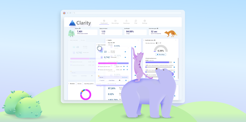
In this post, we’ll share a practical framework for turning website KPIs into an ongoing feedback loop. We’ll use Microsoft Clarity as a working example, but the principles apply to any analytics tool. The goal isn’t to track more metrics; it’s to make the ones you already care about easier to understand and harder to ignore.
1. Start With Behavior, Not Dashboards
Before touching dashboards or reports, it helps to ground KPIs in something more concrete than numbers: repeated user behavior.
Every meaningful KPI is really a proxy for a pattern. It reflects whether users are moving smoothly or struggling, finding clear paths or getting lost, acting with confidence or hesitating along the way.
Label Common Behavior Patterns
Rather than jumping straight to “bounce rate” or “conversion rate,” start by naming what you see:
- Confusion loops: users bouncing between pages or reopening menus
- Hesitation patterns: repeated clicks, excessive scrolling, or partial form completion
- User friction: dead clicks, rage clicks, or repeated errors
Once teams share language for these patterns, KPIs stop feeling abstract. You’re no longer tracking numbers; you’re tracking whether specific behaviors are becoming more or less common.
2. Design Dashboards That Encourage Regular Review
Dashboards don’t just display KPIs; they quietly shape how (and whether) teams look at them.
A cluttered dashboard trains people to skim or ignore it. A focused one pulls attention to the right data.
Customize Dashboard Cards
Small dashboard adjustments can have an outsized impact. Any report or data set that doesn’t directly align with the KPIs you need to track should be moved, deprioritized, or disabled.
Key changes you can make in Clarity include:
- Setting default card tabs so the most meaningful view loads first
- Hiding low-priority cards that don’t support decisions
- Grouping cards by behavior, not just by page or funnel step
For example, imagine you’re working on a project focused on tracking blog performance. If you’re not running paid campaigns to drive traffic to your blog, the advertising card likely isn’t adding much value. Disabling it frees up above-the-fold space in your dashboard for cards that are more relevant to this goal, such as the Referral and Channel card, which shows how readers are actually finding your content.
3. Make Session Recordings Part of KPI Tracking
Charts are useful, but they don’t tell the full story.
KPIs can move in the “right” direction while the underlying experience quietly degrades. Without more context, it’s easy to draw the wrong conclusions.
That’s why session recordings shouldn’t be an occasional deep dive. They should be a regular part of how KPIs are tracked.
Build a Lightweight Replay Habit
This doesn’t mean watching hours of video. It means:
- Reviewing a small, consistent sample tied to a KPI
- Watching sessions before interpreting metric changes
- Using replays to validate what the numbers suggest
Additionally, features like Clarity Highlights can help speed up this process by condensing session recordings into short reels that contain the most important moments of a user’s journey.
A great example of this concept in practice is how the AllEvents team incorporated session recordings into their workflow . As they worked to overhaul the user experience for the product, they built a daily habit of collectively watching session recordings. This routine of analyzing event data and session recordings together helped the team identify key pain points and design a smoother digital experience.
4. Use Segments to Keep KPIs Relevant as Traffic Changes
Site-wide averages only work when your audience is stable. As traffic sources, intent levels, and user expectations shift, a single KPI can start hiding meaningful changes in behavior.
That’s where segments come in.
Instead of tracking one global number and hoping it still reflects reality, segments let you ask whether your KPIs hold up across different types of users. They help you see who a KPI is actually describing—and who it’s masking.
With segments, you can start asking more precise questions:
- Do new users behave differently than returning ones?
- Where does high-intent traffic struggle most?
- Which audiences experience the most friction?
Example: Tracking AI-Driven Traffic
The behavior patterns of referral traffic from AI sources tends to differ from traffic sent by traditional channels. These users may land deeper in the site, skip navigation entirely, or move faster through content.
Creating a segment for traffic sourced from ChatGPT or other AI platforms allows you to track KPIs in context. You can:
- Compare engagement patterns to traditional referrals
- Identify content that confuses or satisfies AI-referred users
- Track whether experiences improve over time for this audience
5. Close the Loop: From KPI Review to Action
The most overlooked part of KPI tracking isn’t measurement; it’s follow-through.
Teams often do the hard work of defining KPIs, building dashboards, and even reviewing them regularly. But without a clear path from observation to action, those metrics stall. They get discussed, acknowledged, and then quietly deferred until the next review.
What separates effective KPI tracking from passive reporting is a repeatable loop, one that connects what you see to what you change.
Effective teams tend to follow a simple but disciplined cadence:
- Review KPIs to identify what’s changed or stalled
- Validate patterns with session recordings to understand why
- Agree on one behavior to improve, not a long list of fixes
- Ship a specific change tied to that behavior
- Watch how behavior responds in the next round of data and replays
This loop keeps KPIs grounded in real user experience. Instead of asking, “Did the metric move?” teams start asking, “Did user behavior actually improve?”
When KPI tracking works this way, dashboards stop being status reports. They become early warning systems—and a forcing function for better decisions.
Conclusion
Dashboards, KPIs, and metrics only matter when they tell a story you can act on. By pairing dashboards with session recordings and thoughtful segments, you turn passive metrics into signals that actually guide decisions. Patterns become visible, insights become clear, and every KPI becomes a tool for improvement rather than a figure to glance at once a month.
In 2026, the sites that win aren’t the ones with the most data; they’re the ones shaped by teams that watch, understand, and respond to behavior in real time.