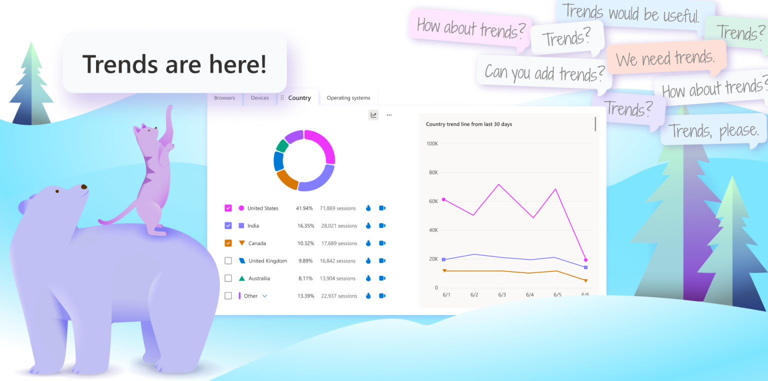
In today’s data-heavy environment, seeing the bigger picture is key to making smarter, faster decisions and more important than ever before. Microsoft Clarity users have spoken, and we’ve listened.
That’s why we’re excited to introduce one of our most requested features: Trends featuring line graphs on dashboard cards, making it easier than ever to visualize trends over time and uncover what’s really happening beneath the numbers.
Why Trends Matter
A single data point tells you what’s happening, but Clarity’s trends enable users to take data a step further by showing why. Spotting changes over time helps you catch early signals, measure the impact of product updates, and make informed decisions with confidence.
Whether you’re tracking a spike in user engagement or diagnosing a sudden drop-off, visualizing trends gives you the context you need to take action.
Until now, data in your Clarity was presented as static data points. But with trends, you can now:
- Track valuable data trends over time: Instantly see a graph of your data points
- Uncover new insights over time: Spot data trends to make better-informed decisions
Use Cases/Real Impact:
Here’s how visualizing Clarity’s trends with line graphs can improve your workflow:
- Marketers can track how campaign changes affect sessions, engagement, or conversions over time—without exporting to another tool.
- Product teams can monitor user behavior trends post-release to validate feature adoption or catch early signs of friction.
- UX designers can spot sudden shifts in scroll depth or rage clicks that may signal usability issues needing quick attention.
- Stakeholders can get a clearer picture of what’s working—backed by visual data they can easily understand and act on.
How it Works + Getting Started
Clarity’s Trends is available to all Clarity users—no extra setup required.
To get started:
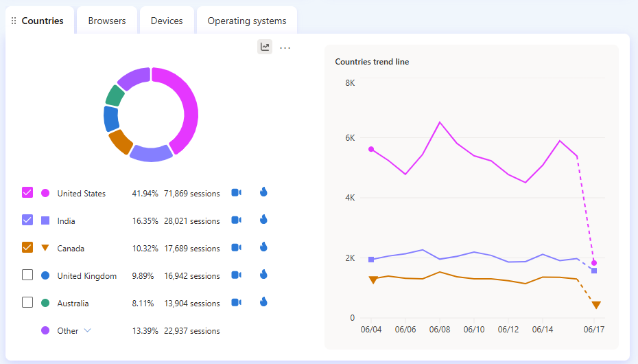
- Go to your Clarity dashboard
- View a card in your Clarity dashboard (Ex: Country)
- Click on the graph icon on the right-hand corner
- Start exploring trend line from the last 30 days
New Insights. Better Informed Decisions
At Clarity, we’re always listening to our users to bring improvements and create valuable features to help our users better understand user behavior. With Clarity’s trends, we’re giving you the tools to visualize how your metrics have changed over time so you can make better-informed decisions.
Ready to get started? Sign in to your Clarity dashboard and check out your trends today!