How Onward Turned Confusing CTAs into 40 New Consultations with Microsoft Clarity
When Deep Forestry wanted more value from its traffic, they turned to Onward Agency to understand why visitors weren’t converting. Onward used Microsoft Clarity to visualize real user behavior, uncover hidden friction around key calls-to-action (CTAs), and redesign the conversion flow to better match user expectations. By simplifying the page and reframing the offer, they transformed stalled interest into 40 new consultation bookings and a significant lift in engagement.
About Onward Agency & Deep Forestry
Onward Agency is a digital design and CRO-focused firm that builds high-performing websites, brands, and apps for high-growth companies in tech, fintech, web3, and healthcare. Founded by Bojan Mitevski and Sergej Spirovski, Onward is an agency that integrates high-performance conversion rate optimization (CRO) into every design.
Deep Forestry is a specialized provider of forestry and drone services. With strong organic search rankings and steady lead volume, their website was already attracting a qualified audience. But despite that traffic, visitors weren’t converting at the rate the business needed. Deep Forestry partnered with Onward to diagnose the problem and turn attention into booked consultations.
The Challenge
Deep Forestry’s website was doing one thing very well: attracting the right people. The site ranked strongly in organic search and generated solid traffic. Yet conversions from key pages lagged behind expectations.
Traditional analytics tools showed decent session numbers but couldn’t explain why users were dropping off at the final step.
Relying on aggregate analytics alone meant guessing at the friction points. To drive meaningful CRO improvements, Onward needed a way to see exactly how users were interacting with the page and where confusion was occurring.
The Solution
Onward implemented Microsoft Clarity as a core part of their CRO workflow for Deep Forestry. While they had previously used Hotjar, Clarity offered a more cost-effective solution with deeper capabilities they could standardize across all client projects.
Using Clarity’s heatmaps, session recordings, and Copilot integration, Onward was able to identify where users were clicking around key CTAs instead of following a clear path. From there, they could watch real sessions to understand how visitors engaged with the page and how far they got in the process.
Onward also used Copilot to quickly extract insights and metrics for specific date ranges, then go a level deeper with a manual review of important recordings.

What They Changed
With these new tools and workflows, Onward was able to identify and solve two issues with Deep Forestry’s conversion flow to remove friction and set better expectations.
1. Simplified the Bottom-of-Page Conversion Area
Clarity’s heatmaps showed disproportionate activity around the bottom of the page, especially near the button area. Onward noticed there were three separate CTAs clustered together. Users were confronted with choosing between two “Book a Demo” buttons and a “Contact Us” option.

From recordings, it was clear users were hesitating and bouncing instead of choosing a path. The page was asking them to decide how to engage instead of making the next step obvious.
To rectify the problem, Onward implemented two key changes:
- Replaced the three competing buttons with one clear “Contact Us” form embedded at the bottom of the page.
- Streamlined the layout to naturally guide users into the form instead of bouncing around multiple options.

This new design reduced decision fatigue and made the primary action unmistakable.
2. Reframed the Offer from “Demo” to “Consultation”
Clarity’s session recordings revealed a second, less obvious problem: visitors were misinterpreting the phrase “Book a Demo.” For a company offering forestry and drone services, many users assumed “demo” meant a live drone demonstration — not a strategic conversation about their needs.
To fix this semantic friction, Onward:
- Renamed the main CTA in the navigation bar from “Book a Demo” to “Book a Free Consultation.”
- Created a dedicated consultation page that aligned with this new wording and clearly described what users could expect.
This small but critical change brought the language in line with the actual service being offered — a consultative discussion — and reduced the risk of mismatched expectations.
The Results
Because Deep Forestry already had strong organic traffic, the impact of the changes was both immediate and measurable. And once the new CTA structure and messaging went live, Clarity made it easy to track the difference.

Key outcomes included:
- 40 new consultation bookings via the updated “Book a Free Consultation” CTA over the following four months, up from zero demo page conversions before.
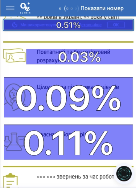
- Dead clicks decreased from 9.5% to just 0.5%, showing that users were no longer wasting clicks on confusing or unhelpful elements.
- Average time on page increased from 1.3 minutes to 1.6 minutes, indicating deeper, more engaged sessions as users explored content and completed the form.
- Sessions increased by 85% and users increased by 82%..
Conclusion
By integrating Microsoft Clarity into their design and CRO process, Onward Agency was able to move beyond surface-level analytics and see exactly where users were struggling. Heatmaps, session recordings, and Copilot summaries gave them the clarity to simplify Deep Forestry’s CTAs, align the offer with user expectations, and remove friction at the most critical point in the journey.
The result was a measurable lift in consultations, engagement, and overall site performance. Clarity has become a standard part of Onward’s toolkit for every client, helping them uncover opportunities, upsell strategic CRO work, and make data-driven decisions that both teams can confidently align around.
“Microsoft Clarity was the missing link in our CRO strategy,” said Mitevski. “It helped us move past assumptions, allowing us to use its superior session recordings and summarization features to pinpoint exact user friction. Clarity is now an indispensable tool for ensuring that our designs actively drive client growth.”