How DropInBlog Used Clarity to Validate UX for an AI-Powered Product
When DropInBlog introduced Blog Pilot™, an AI-powered content planning tool, they needed to ensure users could intuitively understand and act on AI-generated insights. Traditional analytics showed engagement, but not whether users trusted the outputs or knew what to do next. By implementing Microsoft Clarity, DropInBlog was able to observe user behavior, uncover user friction, and refine the experience during beta. This enabled them to build a more intuitive workflow that helped users reach value faster and engage more confidently with the product.
About DropInBlog
DropInBlog is a fully hosted blogging platform designed to integrate seamlessly with existing websites without plugins or complex setup. Founded in 2015, the company provides SEO tools, content publishing workflows, and analytics to help SaaS businesses, ecommerce brands, marketing teams, and solopreneurs grow through organic search.
Led by Founder and CEO Jesse Schoberg, DropInBlog takes a customer-first approach to product development, focusing on building intuitive tools that remove technical barriers and help teams create high-performing content. With customers across a wide range of industries, the platform is designed to make blogging simple, effective, and scalable.
The Challenge
As part of its product innovation efforts, DropInBlog launched Blog Pilot, an AI-powered tool that generates content ideas, prioritizes SEO opportunities, and produces blog post outlines. While the feature produced strong recommendations, it introduced new workflows and unfamiliar concepts that users had to interpret before they could take action. That gap between output and understanding made it difficult to tell whether users were engaging with the tool effectively or getting stuck in the process.
Traditional analytics tools provided visibility into feature usage, but they could not answer more critical questions:
- Did users understand how to evaluate AI-generated topic opportunities?
- Were they confident in the metrics and recommendations presented?
- Could they navigate the workflow intuitively from exploration to action?
Because Blog Pilot™ was still in beta, the team needed to validate how users were actually interacting with the experience before a wider release.
The Solution
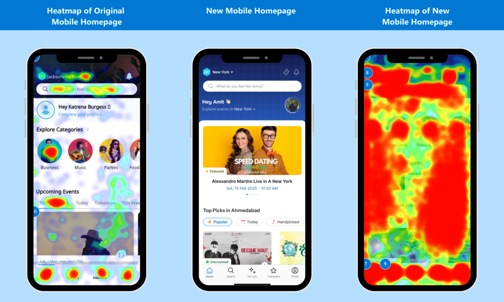
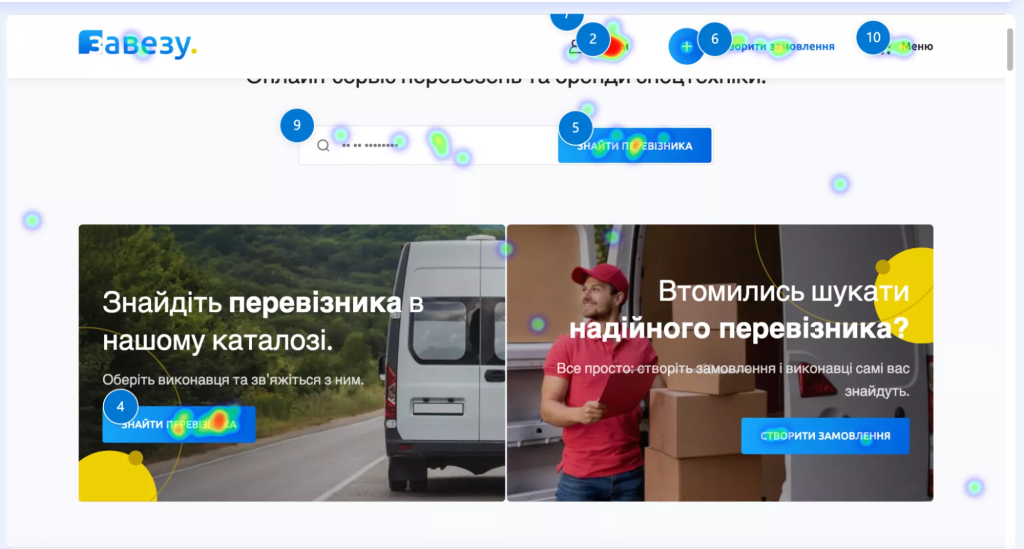
To gain deeper visibility into user behavior, DropInBlog implemented Microsoft Clarity as part of its product development workflow. Using session recordings, click heatmaps, and scroll maps, the team was able to observe how users interacted with Blog Pilot.
Clarity made it possible to move beyond surface-level metrics and understand how users engaged with the AI-powered experience. The team could see where users hesitated, which elements they revisited, and how they navigated between different parts of the workflow.
These behavioral insights revealed consistent patterns.
Users frequently interacted with sorting controls early in their sessions, revisited tooltips to better understand metrics, and navigated in ways that differed from the intended design. Clarity also highlighted moments where users expected interactivity or clearer guidance but did not find it.
By combining these insights with product intuition, DropInBlog was able to validate key assumptions and identify where the experience needed to better support user understanding and decision-making.
What Clarity Helped Them Validate and Improve
1. Users Needed to Prioritize Opportunities Before Taking Action
Clarity revealed that users consistently relied on sorting controls early in their workflow, indicating a strong desire to evaluate and prioritize topic opportunities before engaging further.
To support this behavior, DropInBlog expanded sorting capabilities in the redesigned admin panel, making it easier for users to organize and compare topic groups based on relevance and potential impact.
2. Users Relied on Contextual Information to Trust AI-Generated Insights
Session recordings showed that users frequently hovered over and revisited tooltips while evaluating metrics such as search volume and difficulty. This behavior highlighted the importance of contextual explanations in helping users interpret AI outputs.
In response, DropInBlog redesigned its tooltip system to provide clearer, more accessible explanations directly within the workflow, reducing visual clutter while still supporting informed decision-making.
3. Users Expected More Intuitive Interaction Patterns
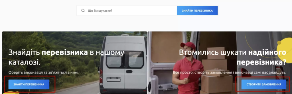
Click behavior revealed hesitation around the “Use This Topic Group” CTA, with users appearing to expect the topic group cards to be interactive.
To align with these expectations, DropInBlog simplified the interaction model by making the entire card clickable, allowing users to move forward more naturally without needing to identify a specific button.
4. Users Navigated Exploratory Workflows Differently Than Expected
Clarity showed that users often bypassed built-in navigation controls and instead returned to Blog Pilot through the main menu, suggesting that key navigation elements were not prominent enough.
The team addressed this by redesigning the navigation experience and making breadcrumb navigation more visible, enabling faster and more intuitive backtracking.
5. Users Needed Clearer Context Around Key Metrics
Users frequently paused on certain metrics, such as posts published and difficulty scores. This behavior persisted even in instances when tooltips were available, showing that users were struggling to understand the meaning of these metrics.
To improve clarity, DropInBlog enhanced these metrics with more explicit contextual explanations and clearer indicators, helping users interpret the data with greater confidence.
The Results
Following these Clarity-informed improvements, DropInBlog observed meaningful changes in how users engaged with Blog Pilot during its beta phase.
Users were able to evaluate topic opportunities more confidently, navigate between views more efficiently, and better understand the metrics and insights presented by the AI-powered feature.
As a result, users progressed further through the workflow—from initial exploration to deeper content planning—reaching key “aha” moments faster and engaging more meaningfully with the product.
These insights also directly informed the redesign of DropInBlog’s admin panel, ensuring that the validated improvements were embedded into the broader product experience.
Conclusion
By integrating Microsoft Clarity into its product development process, DropInBlog was able to validate not just how users interacted with a new feature, but how they understood and trusted an AI-powered workflow.
Session recordings, heatmaps, and behavioral insights helped the team uncover subtle friction points that traditional analytics could not reveal, enabling them to refine the experience before a full release.
The result was a more intuitive, user-aligned product that bridges the gap between powerful AI-generated insights and real user decision-making. Clarity has become an essential tool for DropInBlog, helping the team ensure that innovation translates into meaningful, usable experiences for their customers.
“Microsoft Clarity played a critical role in helping us refine Blog Pilot during its beta launch,” said Schoberg. “While traditional analytics showed us feature usage, Clarity allowed us to see how users actually experienced an AI-driven workflow. Session recordings and heatmaps helped us uncover friction points, improve clarity, and make confident UX decisions backed by real behavior. Clarity has become an essential part of how we validate and refine new features at DropInBlog.”