DropInBlog

DropInBlog

How DropInBlog Used Clarity to Validate UX for an AI-Powered Product

When DropInBlog introduced Blog Pilot™, an AI-powered content planning tool, they needed to ensure users could intuitively understand and act on AI-generated insights. Traditional analytics showed engagement, but not whether users trusted the outputs or knew what to do next. By implementing Microsoft Clarity, DropInBlog was able to observe  user behavior, uncover user friction, and refine the experience during beta. This enabled them to build a more intuitive workflow that helped users reach value faster and engage more confidently with the product.

About DropInBlog

DropInBlog is a fully hosted blogging platform designed to integrate seamlessly with existing websites without plugins or complex setup. Founded in 2015, the company provides SEO tools, content publishing workflows, and analytics to help SaaS businesses, ecommerce brands, marketing teams, and solopreneurs grow through organic search.

Led by Founder and CEO Jesse Schoberg, DropInBlog takes a customer-first approach to product development, focusing on building intuitive tools that remove technical barriers and help teams create high-performing content. With customers across a wide range of industries, the platform is designed to make blogging simple, effective, and scalable.

The Challenge

As part of its product innovation efforts, DropInBlog launched Blog Pilot, an AI-powered tool that generates content ideas, prioritizes SEO opportunities, and produces blog post outlines. While the feature produced strong recommendations, it introduced new workflows and unfamiliar concepts that users had to interpret before they could take action. That gap between output and understanding made it difficult to tell whether users were engaging with the tool effectively or getting stuck in the process.

Traditional analytics tools provided visibility into feature usage, but they could not answer more critical questions:

  • Did users understand how to evaluate AI-generated topic opportunities?
  • Were they confident in the metrics and recommendations presented?
  • Could they navigate the workflow intuitively from exploration to action?

Because Blog Pilot™ was still in beta, the team needed to validate how users were actually interacting with the experience before a wider release.

The Solution

To gain deeper visibility into user behavior, DropInBlog implemented Microsoft Clarity as part of its product development workflow. Using session recordings, click heatmaps, and scroll maps, the team was able to observe how users interacted with Blog Pilot.

Clarity made it possible to move beyond surface-level metrics and understand how users engaged with the AI-powered experience. The team could see where users hesitated, which elements they revisited, and how they navigated between different parts of the workflow.

These behavioral insights revealed consistent patterns.

Users frequently interacted with sorting controls early in their sessions, revisited tooltips to better understand metrics, and navigated in ways that differed from the intended design. Clarity also highlighted moments where users expected interactivity or clearer guidance but did not find it.

By combining these insights with product intuition, DropInBlog was able to validate key assumptions and identify where the experience needed to better support user understanding and decision-making.

What Clarity Helped Them Validate and Improve

1. Users Needed to Prioritize Opportunities Before Taking Action

Clarity revealed that users consistently relied on sorting controls early in their workflow, indicating a strong desire to evaluate and prioritize topic opportunities before engaging further.

To support this behavior, DropInBlog expanded sorting capabilities in the redesigned admin panel, making it easier for users to organize and compare topic groups based on relevance and potential impact.

2. Users Relied on Contextual Information to Trust AI-Generated Insights

Session recordings showed that users frequently hovered over and revisited tooltips while evaluating metrics such as search volume and difficulty. This behavior highlighted the importance of contextual explanations in helping users interpret AI outputs.

In response, DropInBlog redesigned its tooltip system to provide clearer, more accessible explanations directly within the workflow, reducing visual clutter while still supporting informed decision-making.

3. Users Expected More Intuitive Interaction Patterns

Click behavior revealed hesitation around the “Use This Topic Group” CTA, with users appearing to expect the topic group cards to be interactive.

To align with these expectations, DropInBlog simplified the interaction model by making the entire card clickable, allowing users to move forward more naturally without needing to identify a specific button.

4. Users Navigated Exploratory Workflows Differently Than Expected

Clarity showed that users often bypassed built-in navigation controls and instead returned to Blog Pilot through the main menu, suggesting that key navigation elements were not prominent enough.

The team addressed this by redesigning the navigation experience and making breadcrumb navigation more visible, enabling faster and more intuitive backtracking.

5. Users Needed Clearer Context Around Key Metrics

Users frequently paused on certain metrics, such as posts published and difficulty scores. This behavior persisted even in instances when tooltips were available, showing that users were struggling to understand the meaning of these metrics.

To improve clarity, DropInBlog enhanced these metrics with more explicit contextual explanations and clearer indicators, helping users interpret the data with greater confidence.

The Results

Following these Clarity-informed improvements, DropInBlog observed meaningful changes in how users engaged with Blog Pilot during its beta phase.

Users were able to evaluate topic opportunities more confidently, navigate between views more efficiently, and better understand the metrics and insights presented by the AI-powered feature.

As a result, users progressed further through the workflow—from initial exploration to deeper content planning—reaching key “aha” moments faster and engaging more meaningfully with the product.

These insights also directly informed the redesign of DropInBlog’s admin panel, ensuring that the validated improvements were embedded into the broader product experience.

Conclusion

By integrating Microsoft Clarity into its product development process, DropInBlog was able to validate not just how users interacted with a new feature, but how they understood and trusted an AI-powered workflow.

Session recordings, heatmaps, and behavioral insights helped the team uncover subtle friction points that traditional analytics could not reveal, enabling them to refine the experience before a full release.

The result was a more intuitive, user-aligned product that bridges the gap between powerful AI-generated insights and real user decision-making. Clarity has become an essential tool for DropInBlog, helping the team ensure that innovation translates into meaningful, usable experiences for their customers.

“Microsoft Clarity played a critical role in helping us refine Blog Pilot during its beta launch,” said Schoberg. “While traditional analytics showed us feature usage, Clarity allowed us to see how users actually experienced an AI-driven workflow. Session recordings and heatmaps helped us uncover friction points, improve clarity, and make confident UX decisions backed by real behavior. Clarity has become an essential part of how we validate and refine new features at DropInBlog.”

Onward

Onward

How Onward Turned Confusing CTAs into 40 New Consultations with Microsoft Clarity 

When Deep Forestry wanted more value from its traffic, they turned to Onward Agency to understand why visitors weren’t converting. Onward used Microsoft Clarity to visualize real user behavior, uncover hidden friction around key calls-to-action (CTAs), and redesign the conversion flow to better match user expectations. By simplifying the page and reframing the offer, they transformed stalled interest into 40 new consultation bookings and a significant lift in engagement. 

About Onward Agency & Deep Forestry 

Onward Agency is a digital design and CRO-focused firm that builds high-performing websites, brands, and apps for high-growth companies in tech, fintech, web3, and healthcare. Founded by Bojan Mitevski and Sergej Spirovski, Onward is an agency that integrates high-performance conversion rate optimization (CRO) into every design. 

Deep Forestry is a specialized provider of forestry and drone services. With strong organic search rankings and steady lead volume, their website was already attracting a qualified audience. But despite that traffic, visitors weren’t converting at the rate the business needed. Deep Forestry partnered with Onward to diagnose the problem and turn attention into booked consultations. 

The Challenge 

Deep Forestry’s website was doing one thing very well: attracting the right people. The site ranked strongly in organic search and generated solid traffic. Yet conversions from key pages lagged behind expectations. 

Traditional analytics tools showed decent session numbers but couldn’t explain why users were dropping off at the final step. 

Relying on aggregate analytics alone meant guessing at the friction points. To drive meaningful CRO improvements, Onward needed a way to see exactly how users were interacting with the page and where confusion was occurring. 

The Solution 

Onward implemented Microsoft Clarity as a core part of their CRO workflow for Deep Forestry. While they had previously used Hotjar, Clarity offered a more cost-effective solution with deeper capabilities they could standardize across all client projects. 

Using Clarity’s heatmaps, session recordings, and Copilot integration, Onward was able to identify where users were clicking around key CTAs instead of following a clear path. From there, they could watch real sessions to understand how visitors engaged with the page and how far they got in the process.  

Onward also used Copilot to quickly extract insights and metrics for specific date ranges, then go a level deeper with a manual review of important recordings.

onward, deep forestry Clarity Heatmap with AI Insights

What They Changed 

With these new tools and workflows, Onward was able to identify and solve two issues with Deep Forestry’s conversion flow to remove friction and set better expectations. 

1. Simplified the Bottom-of-Page Conversion Area 

Clarity’s heatmaps showed disproportionate activity around the bottom of the page, especially near the button area. Onward noticed there were three separate CTAs clustered together. Users were confronted with choosing between two “Book a Demo” buttons and a “Contact Us” option.

Onward, Deep Forestry Before Three CTAs

From recordings, it was clear users were hesitating and bouncing instead of choosing a path. The page was asking them to decide how to engage instead of making the next step obvious. 

To rectify the problem, Onward implemented two key changes: 

  • Replaced the three competing buttons with one clear “Contact Us” form embedded at the bottom of the page. 
  • Streamlined the layout to naturally guide users into the form instead of bouncing around multiple options. 
Onward, Deep Forestry Contact Us Page After

This new design reduced decision fatigue and made the primary action unmistakable. 

2. Reframed the Offer from “Demo” to “Consultation” 

Clarity’s session recordings revealed a second, less obvious problem: visitors were misinterpreting the phrase “Book a Demo.” For a company offering forestry and drone services, many users assumed “demo” meant a live drone demonstration — not a strategic conversation about their needs. 

To fix this semantic friction, Onward: 

  • Renamed the main CTA in the navigation bar from “Book a Demo” to “Book a Free Consultation.” 
  • Created a dedicated consultation page that aligned with this new wording and clearly described what users could expect. 

This small but critical change brought the language in line with the actual service being offered — a consultative discussion — and reduced the risk of mismatched expectations. 

The Results 

Because Deep Forestry already had strong organic traffic, the impact of the changes was both immediate and measurable. And once the new CTA structure and messaging went live, Clarity made it easy to track the difference.

Onward, Deep Forestry Smart Events Graph

Key outcomes included: 

  • 40 new consultation bookings via the updated “Book a Free Consultation” CTA over the following four months, up from zero demo page conversions before. 
  • Dead clicks decreased from 9.5% to just 0.5%, showing that users were no longer wasting clicks on confusing or unhelpful elements. 
  • Average time on page increased from 1.3 minutes to 1.6 minutes, indicating deeper, more engaged sessions as users explored content and completed the form. 
  • Sessions increased by 85% and users increased by 82%.. 

Conclusion 

By integrating Microsoft Clarity into their design and CRO process, Onward Agency was able to move beyond surface-level analytics and see exactly where users were struggling. Heatmaps, session recordings, and Copilot summaries gave them the clarity to simplify Deep Forestry’s CTAs, align the offer with user expectations, and remove friction at the most critical point in the journey. 

The result was a measurable lift in consultations, engagement, and overall site performance. Clarity has become a standard part of Onward’s toolkit for every client, helping them uncover opportunities, upsell strategic CRO work, and make data-driven decisions that both teams can confidently align around. 

“Microsoft Clarity was the missing link in our CRO strategy,” said Mitevski. “It helped us move past assumptions, allowing us to use its superior session recordings and summarization features to pinpoint exact user friction. Clarity is now an indispensable tool for ensuring that our designs actively drive client growth.”

Netpeak & ON Clinic

Netpeak & ON Clinic

How Netpeak Increased Healthcare Conversions by 25% with Microsoft Clarity

When ON Clinic wanted to make it easier for patients to book appointments and access medical services online, they partnered with Netpeak to optimize their website’s user experience. By leveraging Microsoft Clarity to understand real user behavior, the team uncovered hidden friction, improved navigation, and redesigned key pages — resulting in a measurable boost in conversions for appointment bookings, calls, and requests. 

About Netpeak & ON Clinic 

Netpeak is Ukraine’s leading digital marketing agency, helping mid-sized and enterprise brands scale through data-driven strategies and exceptional user experiences. With clients like PUMA, OLX, Uklon, COMFY, Kyivstar, and Intertop, Netpeak combines technical expertise with actionable insights to deliver measurable results.

ON Clinic operates a network of medical centers across more than 10 Ukrainian cities, providing diagnostic, treatment, and preventive healthcare services. Their goal is to make medical care accessible, transparent, and convenient — both in-person and online. 

The Challenge 

ON Clinic sought to increase the conversion rate from website visits to key actions, including appointment bookings, phone calls, and service requests. 

Although high-level analytics highlighted some drop-offs in the patient journey, the reasons behind them remained unclear. Netpeak identified several challenges: 

  • Unclear navigation and conversion paths on service pages, medical center pages, and the homepage. 
  • Mobile usability issues, including buttons and interactive elements that did not meet recommended touch area guidelines. 
  • Ineffective promotional banners and content layouts that didn’t guide users toward action. 
  • User confusion around clinic locations and doctor browsing, limiting exploration of available services. 

To address these challenges, Netpeak needed detailed, session-level behavioral insights — something traditional analytics tools could not provide. 

The Solution 

Netpeak implemented Microsoft Clarity on ON Clinic’s website to gain a deep understanding of user interactions. Through session recordingsheatmaps, and scroll maps, the team was able to: 

  • Watch recordings of patient sessions from first visit to appointment booking. 
  • Identify friction points and usability issues, including non-clickable elements, confusing navigation, and sections with too much content. 
  • Measure engagement with promotional banners, forms, and service information. 

“Using heatmaps and scroll maps in Clarity, we analyzed user behavior and identified the specific pages with the highest level of interaction to determine optimization priorities,” said Artem Diachenko, Marketing Specialist at Netpeak.” 

What They Changed 

Based on Clarity insights, Netpeak implemented a series of UX and CRO improvements on priority pages: 

1. Homepage 

Slider and Call-to-Action Optimization: Removed duplicate “Book” buttons and enabled banner clicks to improve usability and mobile accessibility. 

Scroll Distribution: Moved text blocks lower to prevent content overload and encourage users to explore the full page. 

Simplified Locations Block: Showed only city names for faster navigation and reduced scanning time.

on clinic new locations block design

2. Service Pages

on clinic new service page scroll map
  • Integrated Booking Links: Added clickable phone numbers and contact forms directly within service descriptions to make conversion points immediately accessible. 
  • Interactive Banner Updates: Added pagination dots to promotional banners to indicate interactivity and improve engagement. 

3. Medical Center Pages

On Clinic rage clicks map
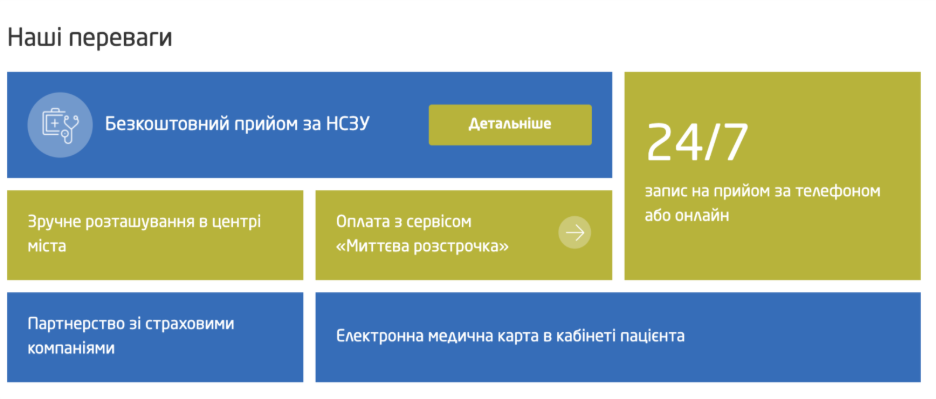
  • Clickable Elements: Redesigned informational blocks (e.g., 24/7 support, in-house labs) so users can access relevant details.
on clinic redesigned page
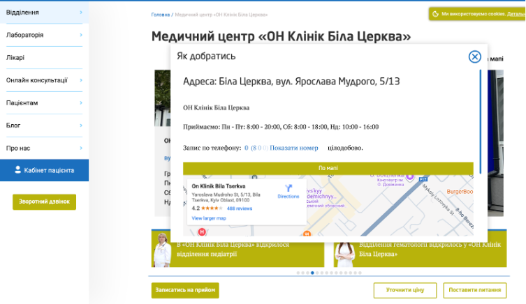
  • Map Functionality: Enabled address links to open maps directly, helping users locate clinics.
on clinic new map page
  • District Clarification: Added specific district names (e.g., “Odesa (Tairova)”) to reduce confusion for unfamiliar users.
on clinic updated clinic location page
  • Doctor Browsing Pagination: Improved horizontal scrolling with clear pagination indicators, helping users track available profiles.
on clinic new doctor page

The Results 

Netpeak’s systematic, data-driven approach yielded substantial improvements across ON Clinic’s website. 

netpeak key outcomes: 25.1% increase in homepage conversions, 26.3% increase in service page conversions, 78.9% increase in medical center page conversions

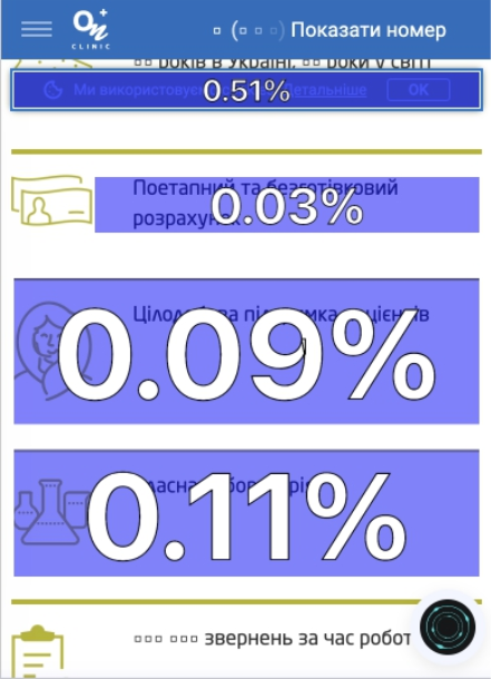
ON Clinic saw a 25.1% increase in homepage conversions, with more visitors moving from landing on the site to taking action. Service page conversions rose by 26.3%, driven by clearer calls to action and in-text links that made it easier for patients to request appointments. The largest increase came from medical center pages, where conversions jumped by 78.9% thanks to improved location clarity that helped patients confidently choose the right clinic. 

Conclusion 

By combining Microsoft Clarity’s behavioral insights with Netpeak’s UX and CRO expertise, ON Clinic significantly increased appointment bookings, calls, and service requests across its network. 

Netpeak’s data-driven approach also demonstrated that thoughtful UX optimization is not just a design exercise — it’s a business lever that directly impacts user engagement and business performance. 

“Clarity allowed us to see real user scenarios, uncover subtle interaction barriers, and understand how visitors make decisions on the website,” said Diachenko. “Today, Clarity analytics has become an integral part of our continuous improvement process across all projects.”

instacar

instacar

How instacar Used Microsoft Clarity to Streamline Digital Leasing and Increase Conversions   

When instacar set out to modernize vehicle leasing in Greece, they needed visibility into every step of the customer journey. By using Microsoft Clarity to understand real user behavior, the team uncovered hidden friction, improved usability, and boosted conversions across web and mobile. 

About instacar 

Launched in 2019 by Antonis Samothrakis and Antonis Zois, instacar is redefining how people and businesses in Greece access vehicles. What started as a vision to modernize the rigid leasing industry has evolved into a fully digital mobility platform — one that combines flexibility, transparency, and customer-first design. 

Today, instacar offers a seamless digital leasing experience for both individuals and small-to-medium businesses. Through its website, mobile app, and internal fleet management system, customers can lease, buy, or manage vehicles end-to-end — from selecting a car to signing, uploading financial documents, and scheduling delivery. 

As the platform expanded, so did its need to ensure every digital interaction — from quote requests to document uploads — was intuitive, fast, and reliable. 

To solve this problem, Dimosthenis Avgeris, Head of Product at instacar, decided to dig deeper than surface-level metrics and understand each of these user interactions.   

The Challenge 

instacar’s booking process is the heartbeat of its business. The journey involves multiple critical steps, including requesting a leasing quote, uploading financial documents, completing payments, and finally confirming delivery. 

But while high-level analytics tools showed drop-offs within the flow, the why behind them remained unclear. 

“Users often dropped off or made errors, but it wasn’t clear at which step or why,” said Avgeris. “Since most of our traffic is mobile, we needed to be sure the flow was robust on all device types and screen sizes—something that wasn’t visible with numbers alone.” 

The team faced several challenges: 

  • Unclear drop-off points in the quote and document upload flow. 
  • Mobile usability issues, with CSS or UI inconsistencies affecting experience on certain devices. 
  • Friction in exploration, as users navigated car listings, filters, and pricing tools. 
  • Limited visibility into how users understood the platform’s unique selling points or handled complex interactions like financial form uploads. 

Traditional tools like Google Analytics provided aggregate data but lacked the session-level insight needed to identify and fix specific moments of confusion or frustration. 

That’s where Clarity came in. 

The Solution 

To bridge that gap, instacar implemented Microsoft Clarity across both its website and mobile app. 

With Clarity’s session recordingsheatmaps, and smart events, the team gained the visibility they needed to: 

  • Watch real user sessions end-to-end. 
  • Detect rage clicks, slow load times, and usability issues. 
  • Track engagement with key elements like filters, forms, and galleries. 

“Monitoring the full funnel with Clarity meant we could quickly detect where users experienced delays, confusion, or technical difficulties, and make targeted improvements,” Avgeris explained. 

By combining Clarity’s qualitative insights with quantitative metrics, instacar’s product, engineering, and marketing teams could prioritize high-value fixes and move quickly from insight to action. 

What They Changed 

Using insights from Microsoft Clarity, instacar launched a series of data-driven UX and performance improvements across its booking flow and website: 

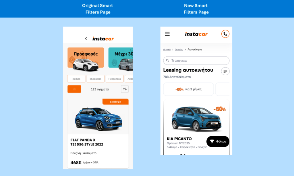
1. Smart Filters for Car Discovery 

  • Redesigned the car listing filters to be more intuitive and mobile-friendly. 
  • Made the entire filter row clickable instead of just the checkbox, reducing frustration and improving the speed of product exploration.
instacar smart filters before and after comparison

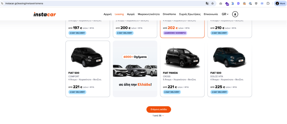
2. Pagination Implementation 

instacar gallery page

Added pagination to long lists of cars, improving page performance, and making it easier for users to navigate listings without feeling overwhelmed. 

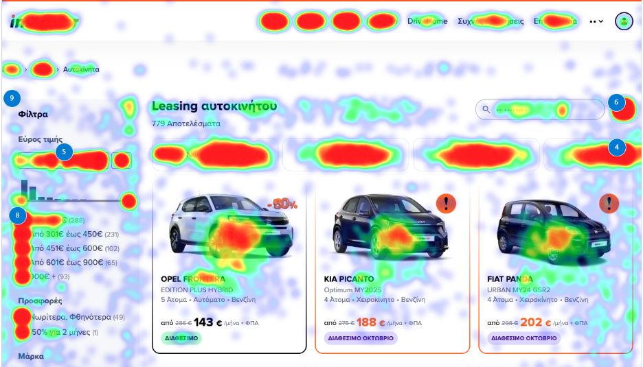
3. Car Gallery Redesign 

  • Revamped the car image viewing experience with an enhanced gallery and mobile navigation. 
  • Added zoomable images and easier swipe functionality to make browsing vehicle details smoother and more engaging.
clarity heatmap of instacar gallery

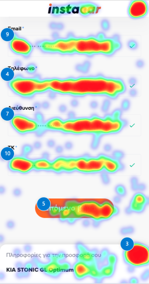
4. Streamlined Financial Form & Document Uploads 

  • Redesigned the multi-step quote and financial data collection process. 
  • Simplified document upload screens with clear CTAs, error handling, and guidance to reduce user confusion. 
  • Ensured the flow worked seamlessly across devices and screen sizes. 
clarity heatmap of instacar registration

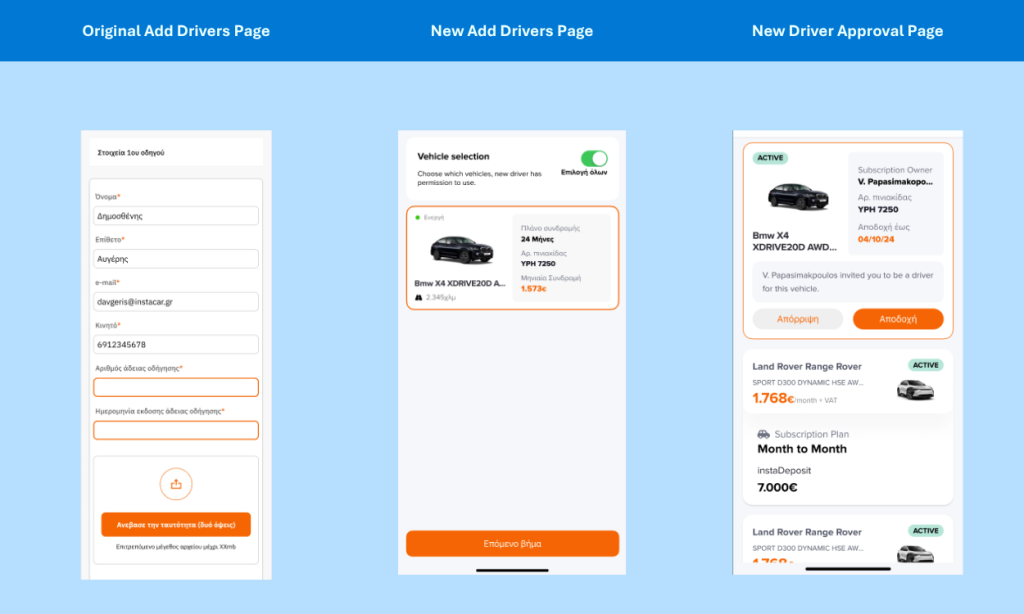
5. Fully Digital “Add Driver” Feature

before and after comparison of instacar add drivers page
  • Transformed a previously manual, pre-delivery process into a self-service flow accessible in both app and web experiences. 
  • Enabled subscription owners to invite additional drivers by email, with invitees completing the process digitally. 
  • Incorporated clear CTAs, required uploads, and in-flow error messaging for better guidance. 

6. Marketing Campaign Visibility 

  • Redesigned promotional elements on the car page and car list experiences to reduce cognitive load and highlight active campaigns more effectively. 
  • Reorganized sections like “Similar Cars” to improve product discovery and encourage exploration. 

7. Overall Usability & Friction Reduction 

  • Addressed UI inconsistencies and device-specific issues identified in Clarity session recordings. 
  • Optimized interactive elements to reduce frustration, such as rage clicks on filters or gallery navigation. 
  • Implemented small but meaningful UX tweaks across the booking flow, vehicle listings, and post-quote actions. 

The Results 

The cumulative effect of Clarity-driven improvements was significant:

Performance & Stability 
28% decrease in average page load time 25% reduction in rage clicks from slow-loading content  14% decrease in mobile session abandonment   
User Experience & Engagement 
17% increase in image interaction rates 13% increase to user engagement times 21% increase in user engagement with the pricing filter 
26% increase in filter-driven searches 18% more cars viewed per user session 90% reduction in rage clicks on filters 
Conversion & Funnel Progression 
7% increase in conversions 49% increase in post-quote form completion rates  15% increase in form submission rates for cars featured in active campaigns 
61% increase in add driver completion rates 100%+ increase in add driver interactions  
Support & Operational Efficiency 
12% reduction in customer support inquiries 57% reduction in customer support calls for requests to add drivers Reduced manual processing time by streamlining credit workflows 

These enhancements not only improved conversion rates and reduced support workload but also created a smoother, more intuitive digital experience that strengthened user trust. 

“Microsoft Clarity proved invaluable by offering detailed, real-time insights into user behavior that traditional analytics overlook,” said Avgeris. “It revealed precise pain points, unexpected user paths, and areas of friction across our site, enabling us to prioritize fixes based on actual user struggles rather than assumptions.” 

Conclusion 

For instacar, Clarity has become more than a UX optimization tool; it’s an integral part of their product development process. By combining behavioral data with experimentation and cross-team collaboration, the company continues to refine its digital experience and accelerate growth. 

“Clarity helped us see exactly how users interact with our website, app & internal fleet management tool, highlighting frustrations and showing us where to focus our efforts,” said Avgeris. “Clarity is now part of how we make ongoing improvements, with decisions grounded in what users actually do, not just what we assume.” 

By keeping the customer’s real journey at the center, and using Clarity to illuminate it, instacar continues to deliver on its mission: making modern mobility simple, flexible, and digital for everyone in Greece. 

Love using Clarity? Share your success story with us! 

Netpeak

Netpeak

How Netpeak Uses Microsoft Clarity to Elevate UX and Boost Conversions for Global Brands

How Netpeak Uses Microsoft Clarity to Elevate UX and Boost Conversions for Global Brands 

Netpeak, Ukraine’s top digital marketing agency, specializes in scaling mid-sized and enterprise brands through data-driven strategies and exceptional user experiences. To level up their UX and CRO services, they turned to Microsoft Clarity — gaining rich behavioral insights that transformed client outcomes and unlocked new growth potential. 

The Challenge: Seeing Beyond the Numbers

Netpeak works with high-profile clients like Vodafone, Puma, Domino’s, and OLX — brands that expect smart, actionable strategies, not guesswork. 

While traditional analytics tools like Google Analytics offered broad metrics like bounce rate or average session duration, they couldn’t answer key questions: 

Why are users dropping off here? 

Which page elements are being ignored? 

What frustrates visitors during their journey? 

These blind spots created friction in conversion optimization workflows. Without real visibility into user behavior, UX and CRO decisions often relied on assumptions or time-consuming manual research.

“Before Clarity, we were missing the visual depth and context needed to fully understand how users were engaging — or failing to engage — with our clients’ websites.” 
Daniel Minin, Head of UX/UI and Partner at Netpeak

The Solution: Microsoft Clarity’s Visual, Actionable Insights 

Netpeak integrated Microsoft Clarity to complement their existing analytics stack — giving their team the tools to analyze real behavior, uncover conversion barriers, and prioritize impactful UX changes. 

Clarity stood out from other tools for its unique mix of: 

  • Click, Scroll & Area Heatmaps that highlight how users engage with every element on a page 
  • Session Recordings that show real user journeys in high fidelity 
  • AI-powered filters to segment traffic and spot trends by source, device, or engagement level 
  • Rage click and dead click tracking to identify sources of user frustration 
  • Zero cost and minimal performance impact, making it easy to implement across projects 

“Clarity didn’t just show us metrics. It helped us see what our users were actually doing — and where they were getting stuck. That changed how we build and optimize sites.” 
Daniel Minin 

Actions Taken: Design Decisions Backed by Behavioral Data 

Armed with Clarity, Netpeak could validate assumptions and make confident, high-impact decisions for their clients. 

On a leading e-commerce site for home appliances: 

Clarity heatmaps revealed that users gravitated toward product origin, warranty details, and delivery options — often skipping other content. The Netpeak team redesigned the product pages to elevate these trust-building elements. 

Result: Add-to-cart conversion rate jumped by 7.36%

On a service-based business homepage: 

Session recordings showed that users were ignoring a large autoplay video placed in the first fold — a major load-time culprit. Removing the video improved both performance and engagement. 

Result: Page load time dropped, and page depth increased by 23.07%

On the Zavezu website redesign: 

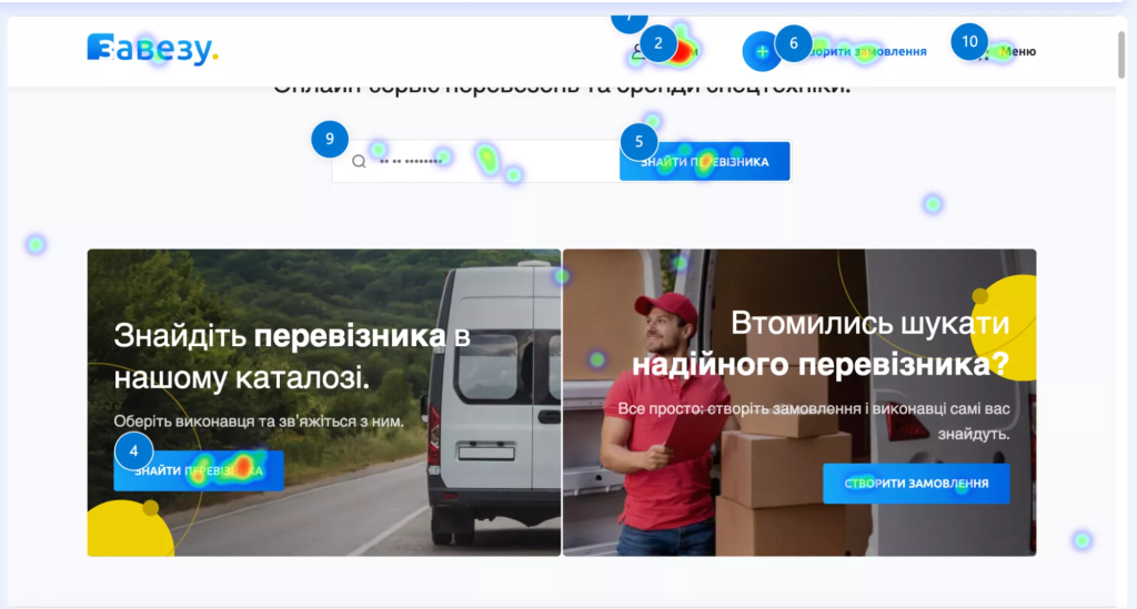
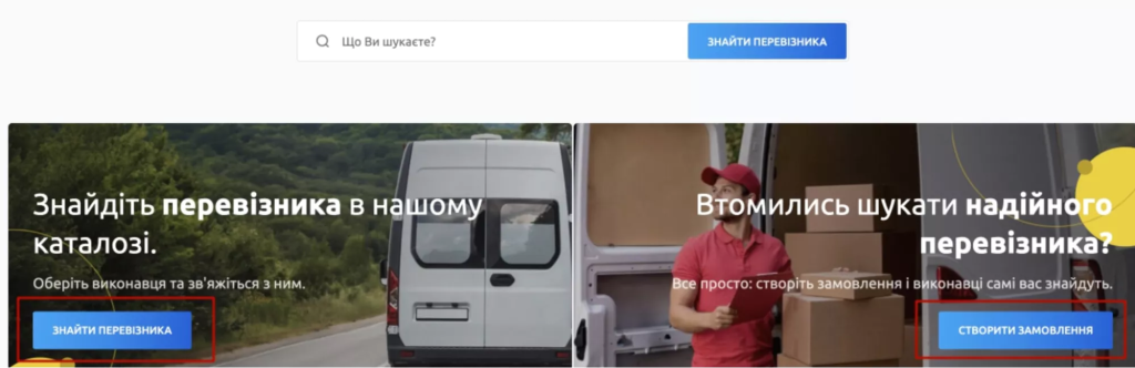
Clarity exposed multiple conversion blockers — including too many CTAs and cluttered layouts. The team simplified the homepage by keeping only one primary CTA and removing non-essential content blocks. 

Result: Smoother navigation, faster load times, and a more intuitive user experience across all devices. 

See full Zavezu case study → 

“Using Clarity, we were able to remove guesswork and prioritize only the most meaningful changes. It made our UX process more efficient and impactful.” 
Daniel Minin 

Results: Tangible Wins Across Clients and Industries 

By using Clarity as a core part of their UX and CRO process, Netpeak achieved: 

  • Higher conversions across key pages by redesigning around what users care about most 
  • Faster site speed by eliminating heavy or underperforming elements 
  • Greater insight into user frustration and drop-off zones 
  • Smarter prioritization of what to test and change — reducing time-to-impact 

And because Clarity is free and easy to deploy, the team could quickly onboard it across multiple projects without budget or IT constraints. 

Key Learnings & Takeaways 

Netpeak now recommends Microsoft Clarity as a must-have tool for any team serious about improving website performance. 

Why Clarity Stands Out: 

  • No impact on site speed 
  • 100% free, forever 
  • Actionable insights, not just metrics 
  • Easy to use for teams of any size 

Whether optimizing enterprise ecommerce funnels or simplifying a service landing page, Clarity enables Netpeak to make every visitor interaction count. 

Thanks to Clarity, they’ve helped their clients turn traffic into results. They now use it across nearly all their CRO projects.

Most companies focus heavily on driving traffic. But at a certain point, acquiring more traffic becomes expensive. Clarity allows you to maximize the value of your existing traffic by improving conversion rates and usability.

Daniel Minin , Head of UX/UI and Partner at Netpeak

Love using Clarity? Share your story with us!

Maven Collective

Maven Collective

How Maven utilized Clarity for an MSP client resulting in 200% surge in form submissions and optimized homepage video placement for a 35% increase in impressions.

Maven Collective Marketing Utilizes Microsoft Clarity to Drive Deeper Insights and Elevate Client Success

Maven Collective Marketing, founded by CEO Erica Hakonson, a veteran with profound insights from her tenure as a Microsoft Technology Adoption Program Manager, specializes in crafting bespoke digital marketing strategies. Since its inception in 2012, they have exclusively served Microsoft Partners, leveraging 18 years of global experience to deliver award-winning solutions in branding, SEO, content marketing, and lead generation. Recognized as the 2024 Top Digital Strategy Firm2024 Best Company to Work With, and the 2023 B2B Agency of the Year, Maven Collective has consistently demonstrated unparalleled expertise in the Microsoft ecosystem, winning over 190 industry accolades. As a certified partner of Microsoft Ads, Google Ads, HubSpot, and others, they have a proven track record of success for their clients. 

The Challenge

As digital landscapes evolve, the complexity of user interactions on websites intensifies, highlighting the limitations of traditional analytics tools. These tools, while rich in quantitative data, lacked the nuanced insights needed to fully understand and improve user experiences. Maven Collective Marketing recognized the necessity to not only gather data but to derive actionable insights that could boost user engagement and conversion rates on their clients’ websites. 

They saw a critical need for deeper insights into user behavior. Traditional analytics provided general data on traffic and basic user metrics but failed to offer detailed visualizations crucial for identifying and addressing specific user pain points. 

The Solution: Microsoft Clarity

To address the limitations of traditional analytics, they implemented Microsoft Clarity, which allowed them to visually capture and analyze user interactions on their clients’ websites. Clarity enabled them to make more informed, data-driven decisions by providing a granular view of user behavior that traditional methods could not offer. By utilizing Clarity’s comprehensive features, including heat maps, session recordings, and user paths, they identified and addressed hidden friction points, optimized user journeys, and significantly improved website performance and conversion rates. 

The adoption of Microsoft Clarity represented a pivotal shift in their analytics approach. Its robust capabilities allowed them to delve deeper into user behavior, providing insights that were previously inaccessible. With tools like heat maps and session recordings, they could visually trace the user’s journey, uncover obstacles, and gain a deeper understanding of user interactions, enhancing the strategic adjustments on their clients’ websites. 

Actions Taken

They tailored their strategies based on insights gained from Clarity: 

  • MSP Client: Heatmaps revealed that crucial CTAs were not prominently displayed. By repositioning these CTAs to catch the user’s eye, they significantly improved visibility and user action rates. 
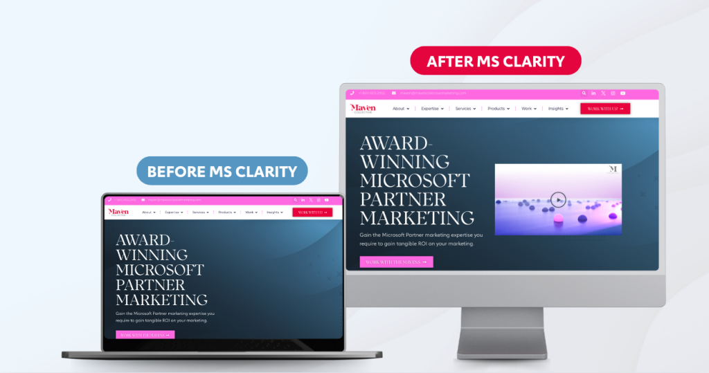
  • Internal Marketing: For their own website, scroll maps showed that important content, like their service overview video, was being overlooked. They adjusted the placement to ensure optimal visibility. Additionally, rage click analysis on their contact forms led to a redesign, making them more intuitive and user-friendly, thereby improving the lead capture process.

Results Overview

The strategic enhancements informed by Microsoft Clarity were transformative: 

  • Repositioning CTAs for their MSP client resulted in a 200% surge in form submissions.  
  • Optimizing homepage video placement on Maven Collective’s Homepage increased video impressions and completion rates by 35%.  
  • Strategic content placement, informed by Clarity data, improved the visibility and effectiveness of marketing materials, contributing to higher lead generation for their internal marketing. With additional details added to their form, they have seen a 400% increase in form submissions year-over-year.  

Key Learnings for Maven

Microsoft Clarity has equipped Maven Collective Marketing with crucial insights into user behavior, enhancing our capability to: 

  • Visualize user paths and optimize website flow, guiding users towards intended actions. 
  • Identify and address dead clicks and rage clicks, improving user satisfaction and pinpointing areas for improvement. 
  • Strategically position content using heatmaps and scroll maps for maximum visibility and engagement. 

The integration of Microsoft Clarity has bridged the gap between traditional analytics and deep user experience insights, empowering them to make data-driven decisions that boost website performance and drive better business outcomes for their clients. They continuously adapt their strategies based on Clarity insights to ensure optimal engagement and conversion on their clients’ websites. 

Clarity has revolutionized our approach, allowing us to spot and fix user issues like confusing navigation and unclear calls-to-action. This has significantly boosted our clients’ results. 

Mandy Brar, Performance Lead, Maven Collective Marketing

Love using Clarity? Share your story with us!

Switas

Switas

How Switas Helped byFood.com Fix the User Journey Leading to an Increase in Conversions in Just Three Months

Switas is a growth consultancy founded in Istanbul, specializing in helping businesses achieve sustainable growth through optimizing digital performance. The company focuses on services such as Conversion Rate Optimization (CRO), product development, and strategic growth management. The brain behind the business is Çağdaş Polat, the Co-Founder of Switas and an experienced digital growth consultant. He oversees the companies strategic planning and works closely with clients across various sectors to implement cutting-edge tools, such as Microsoft Clarity, to solve complex user experience challenges. One of those clients that Switas recently helped onboard and implement with Microsoft Clarity was byFood.com, a leading online platform that connects users with unique culinary experiences in Japan. From booking food tours to finding the best local restaurants, byFood.com enables tourists and locals alike to discover the rich culture and flavors of Japan through engaging blog content related to Japanese cuisine, food culture, and travel experiences.

Learn how Switas achieved the following improvements in just three months:

  • 10% increase in blog conversions
  • 12% reduction in cart abandonment rates
  • 7% increase in overall cart conversion rates

The Challenge

Switas was seeking deeper insights into user behavior on its clients’ digital platforms to address pain points that were negatively impacting user experience and conversion rates. Before adopting Microsoft Clarity, they relied on tools like Google Analytics, Hotjar, and Yandex Metrica to gather behavioral data. However, these tools lacked comprehensive session analysis and detailed behavioral data needed to fully understand user interactions and optimize conversion paths.

For byFood.com, Switas identified a critical issue: users were abandoning the checkout process and they wanted to understand why.

How Microsoft Clarity Helped

Switas implemented Microsoft Clarity to overcome these challenges. Using Clarity’s rage clicks feature, they identified areas where users were repeatedly clicking out of frustration, revealing problematic aspects of the user interface. Additionally, Clarity’s JavaScript error tracking uncovered technical glitches that were affecting the site’s functionality. By pinpointing these issues, the team was able to resolve the frustrations that were leading users to abandon their purchases. The team found Clarity’s live recordings feature particularly beneficial. This allowed them to observe real-time user behavior, providing a detailed view of the checkout process where users were encountering problems. Due to confusing navigation and unclear form instructions, which was significantly impacting conversions and revenue, Switas recommended and implemented changes to byFood.com’s navigation and form instructions.

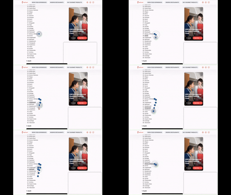
Rage Click Recording showing user frustration

Actions Taken

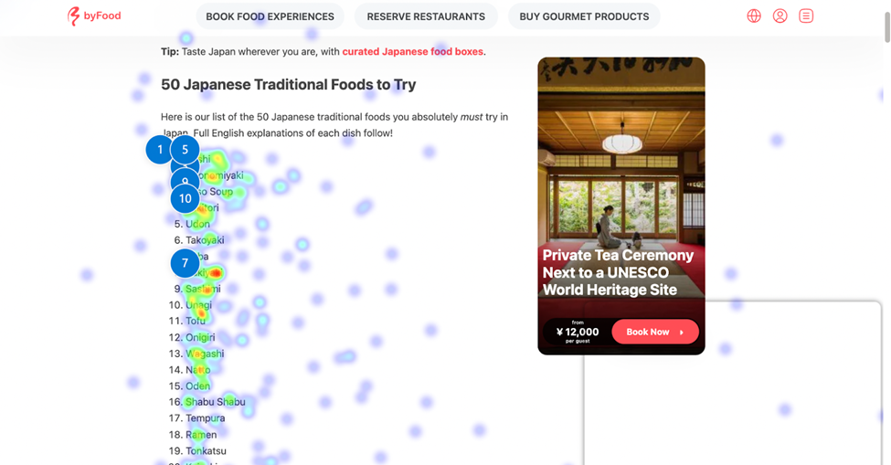
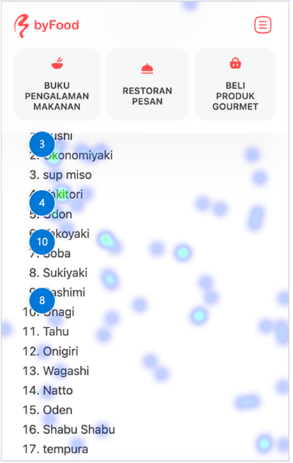
By analyzing click heatmaps and rage clicks data on byFood.com’s blog pages, Switas identified areas of user frustration and recommended a new navigation path for sub-items within the blogs. This led to a 10% increase in conversions and improved overall user interaction with the content.

It was observed that blog post titles without links were still being clicked on. However, since there was no actual link in the post, users were bouncing from some of the most visited pages without engaging further. To address this, the structure of the listing items in blog posts was updated to include clickable links

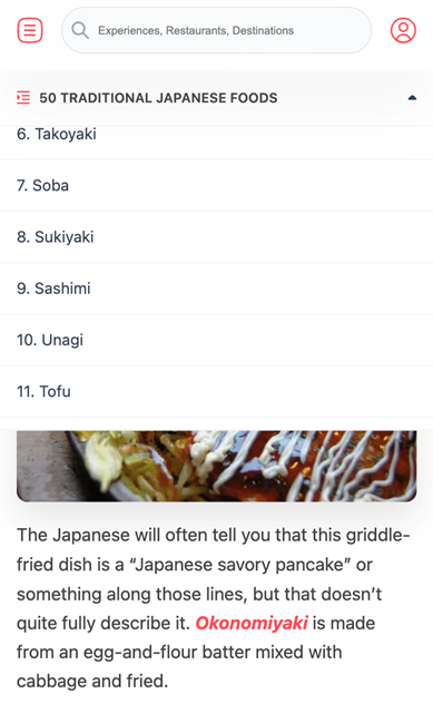
The version on the right, which featured clickable subheadings, was tested against the version on the left, where the subheadings were not clickable. The results showed that the right-side version was more effective.

By addressing a major bottleneck in the user journey, these modifications were made swiftly, and the team used Clarity’s tools to monitor the impact of these changes, iterating as necessary to optimize the user experience further.

Outcomes

Following the implementation of Microsoft Clarity-driven optimizations, Switas observed a 12% reduction in cart abandonment rates and a 7% increase in overall conversion rates within a three-month period for byFood.com. These improvements significantly enhanced user satisfaction and boosted revenue. The actionable insights from Clarity allowed Switas to continuously refine the user experience, demonstrating the effectiveness of Clarity’s features in driving real business results.

Key Learnings

The team highlighted Microsoft Clarity as a product built with practical, real-world use cases in mind by real product people who understand the challenges companies like Switas face. Features such as rage clicks and JavaScript error tracking proved invaluable in identifying user frustrations and technical issues, enabling targeted improvements that directly impacted user experience and conversion rates. Clarity’s intuitive, product-focused design allowed Switas to implement swift, data-driven solutions that delivered measurable outcomes.

“Microsoft Clarity has been a game-changer for Switas, helping us quickly identify and solve UX issues. Features like rage clicks and JavaScript error tracking provided actionable insights, while live session recordings allowed us to optimize in real-time, boosting user satisfaction and conversions. 

Çağdaş Polat, Co-Founder of Switas

Love using Clarity? Share your story with us!

Scrape.do

Scrape.do

Learn how Scrape.do increased their trial sign-ups by 28%

Scrape.do Enhances Conversion Rates and Ad Campaign Effectiveness with Microsoft Clarity

Scrape.do, a cutting-edge web scraping API, helps businesses access critical data from across the web, offering unparalleled flexibility and efficiency. While the platform’s technical capabilities are well-recognized, Scrape.do wanted to optimize its website to boost conversion rates and maximize the effectiveness of its online ad campaigns. The challenge was to understand user behavior better and make data-driven improvements that would lead to more trial sign-ups and higher ROAS (return on ad spend).

The goal was to increase the number of conversions from website visitors and enhance the impact of paid advertising efforts by making strategic adjustments based on user interactions and behavior.

How Microsoft Clarity Provided Key Insights

1. Boosting Conversion Rates by Streamlining the User Journey

Identifying Friction Points: Using Clarity’s session recordings, Scrape.do discovered that many potential customers were abandoning the sign-up process at the form submission stage. The recordings revealed that users were hesitating due to the length of the form and unclear instructions.

Solution: Scrape.do simplified the sign-up form, reducing the number of required fields and adding tooltips to guide users through the process. Additionally, they introduced a progress indicator to show users how close they were to completion, which significantly reduced drop-offs.

Result: This optimization led to a 28% increase in trial sign-ups, as the improved user journey made it easier and more appealing for visitors to complete the registration process.

2. Optimizing Ad Campaign Landing Pages for Higher ROI

Understanding Ad Landing Page Performance: Clarity’s heatmaps and click analytics showed that visitors from ad campaigns were not engaging with the primary CTA on the landing page. Most clicks were concentrated on secondary elements, which detracted from the main conversion goal.

Solution: Scrape.do redesigned the landing pages for their ad campaigns, focusing on a single, clear call-to-action. They removed distractions and highlighted the benefits of signing up for a trial right above the fold.

Result: This change led to a 12% increase in conversions from paid ads, directly improving the return on ad spend (ROAS) and making the campaigns more cost-effective.

3. Increasing Ad Effectiveness Through Behavioral Insights

Refining Targeting with User Behavior Data: By analyzing rage clicks and dead clicks (clicks on non-interactive elements), Scrape.do identified areas where users were frustrated or misled by ad content or landing page design. They noticed that some ads were leading users to believe they were getting something different than what the landing page offered.

Solution: Scrape.do adjusted their ad copy to more accurately reflect the content and offer on the landing page, ensuring that user expectations were met. They also fine-tuned the design to align better with the user’s journey from ad click to conversion.

Result: This resulted in a 20% decrease in bounce rates on ad landing pages and a 15% increase in qualified leads, indicating that users were more aligned with the content they encountered after clicking on an ad.

4. Enhancing Product Page Engagement and Reducing Cart Abandonment

Insights into Cart Abandonment: Clarity’s funnel analysis revealed that a significant number of users were abandoning their carts after reaching the pricing page. Session recordings showed that users were hesitant due to the lack of clear information about payment options and concerns about the checkout process.

Solution: Scrape.do revamped the pricing page to include more detailed information about payment options, including FAQs, and added trust badges to reassure customers. They also streamlined the checkout process to reduce the number of steps required to complete a purchase.

Result: These changes led to a 25% reduction in cart abandonment and a corresponding 18% increase in completed purchases, driving more revenue directly from the website.

Results Overview

  • 28% Increase in Trial Sign-Ups: Simplifying the sign-up process and reducing friction led to a higher conversion rate.
  • 12% Increase in Conversions from Paid Ads: By optimizing landing pages and aligning them with user expectations, Scrape.do significantly boosted its ad campaign effectiveness.
  • 20% Decrease in Ad Landing Page Bounce Rates: Improved ad targeting and landing page relevance led to better user engagement and fewer bounces.
  • 18% Increase in Completed Purchases: Enhancements to the pricing page and checkout process reduced cart abandonment, leading to more sales.

Key Learnings for Scrape.do

  • Simplicity is Key: Reducing friction in the user journey, whether in sign-up forms or checkout processes, can have a substantial impact on conversions.
  • Consistency Across Ad Campaigns: Ensuring that ad content aligns closely with landing page offers and design is crucial for maintaining user trust and driving conversions.
  • Behavioral Data Drives Effective Targeting: Utilizing insights from user behavior, such as rage clicks and session recordings, can refine ad targeting and landing page design, leading to better performance and ROI.
  • Clear Communication on Pricing Pages: Providing transparent and detailed information about pricing and payment options helps to reduce cart abandonment and increases trust with potential customers.

This case study showcases how Scrape.do, through the strategic use of Microsoft Clarity, was able to enhance its website’s performance, leading to significant improvements in conversion rates and ad campaign effectiveness.

Using Microsoft Clarity has been a game-changer for us at Scrape.do. It provided deep insights into user behavior that allowed us to make targeted improvements, resulting in significant increases in conversions and ad campaign effectiveness. The clarity and actionable data it offers are invaluable for optimizing our digital strategies 

Bugrahan Saka, Growth at Scrape.do

Love using Clarity? Share your story with us!

Interteam

Interteam

Learn how Interteam used insights from Clarity to generate over $20,000 in projected ROI in just one week

InterTeam is a premium paid advertising agency that specializes in SaaS & professional services, primarily B2B. The agency manages campaigns on platforms such as Google Ads, Microsoft Ads, Facebook/Instagram Ads, and LinkedIn Ads. In addition to advertising, InterTeam provides supplementary services such as conversion tracking implementation, landing page design and development, creative design, and CRM consultation. Their clientele ranges from small startups to large corporations, all benefiting from their focus on generating qualified leads and driving revenue.

Founded in 2022, InterTeam was established by Cole Furrh, a seasoned paid advertising expert with nearly a decade of experience. Cole has a strong background in managing complex and niche advertising campaigns, especially in the professional services and SaaS sectors. His expertise lies in creating highly customized ad strategies across multiple platforms, tailored to the unique needs of each client. With a full-funnel marketing skillset, Cole leads InterTeam in delivering top-tier solutions, including landing page conversion optimization and advanced tracking implementations.

Challenge

InterTeam was seeking a solution to address specific challenges with their landing pages. They needed a way to audit these pages for potential design flaws, better understand user engagement, and identify sections that caused visitors to bounce. These insights were critical for optimizing the performance of their PPC campaigns and improving overall user experience.

InterTeam’s decision to implement Microsoft Clarity was prompted by a recommendation from one of their Jr. Media Buyers. Before adopting Clarity, InterTeam had experimented with several paid solutions, but found little value in these tools. One major drawback was the negative impact on page load speeds, which not only affected user experience but also hurt conversion rates and increased cost-per-click (CPC) in their PPC campaigns.

How Clarity Helped

Microsoft Clarity provided InterTeam with immediate value, offering a comprehensive set of features that addressed their key challenges. The team leveraged almost every feature of the platform and began exploring its integrations as well. Here’s how InterTeam utilized Clarity’s key functionalities:

Session Recordings:
Session recordings became a vital tool for analyzing visitor behavior, particularly for those who clicked on ads. These recordings revealed that certain campaigns were attracting visitors who left the page almost immediately, likely indicating bot activity. The recordings also helped identify sessions with abnormal mouse movements, another sign of bot traffic. By adjusting their campaigns to exclude these low-quality clicks, InterTeam saved significant costs and prevented poor-quality leads from affecting campaign performance.

Heat & Scroll Mapping:
InterTeam used Clarity’s heat mapping feature to assess how users interacted with different sections of their landing pages. By analyzing click rates on various sections, they removed under-performing content and moved high-engagement sections further up the page to improve visibility.
Scroll maps also allowed them to pinpoint where users were dropping off. This insight helped the team decide whether to reduce the content in certain sections or remove them entirely, leading to more optimized landing pages.

Before

After

Dead Clicks:
Clarity’s dead click feature helped identify broken functionality on the landing pages, such as non-working buttons or icons that appeared interactive but were not. By reviewing recordings, InterTeam was able to promptly address these issues, improving the overall user experience and reducing confusion on the page.

Incorporating Clarity’s tools helped InterTeam optimize their campaigns, refine landing pages, and reduce unnecessary ad spend, all while improving lead quality and campaign performance.

Actions Taken

InterTeam found several features of Microsoft Clarity to be particularly beneficial, with dead clicks standing out as the most impactful. This feature, which they had not been aware of before using Clarity, provided immediate value by identifying heavily interacted-with areas of client websites that were not functioning properly.

A notable example involved a client with an outdated website and poor structure. After installing Clarity, InterTeam discovered that approximately 5% of the site’s clicks were dead clicks. Given the site’s substantial traffic, this statistic was concerning. Upon reviewing session recordings, the team found a page with six buttons that led visitors to invalid URLs. These buttons were previously linked to gated content offering calendar template downloads. The team realized that these clicks were likely from high-quality leads intending to access the lead magnet content.

As a result of these insights, InterTeam took the following actions:

  • New Landing Page Creation: They developed a new, conversion-optimized landing page specifically for the calendar template download, following best practices to ensure a fast page load speed to minimize bounce rates.
  • Redirecting Traffic: All invalid URLs associated with the dead clicks were redirected to the new landing page, ensuring that future traffic from these clicks would be properly directed to the optimized content.

These changes helped recapture valuable lead opportunities and improved the overall user experience on the client’s site.

Outcomes & Improvements

Following the implementation of Microsoft Clarity and the subsequent changes, InterTeam saw immediate and impressive improvements in performance:

Lead Generation:
Within just one week of launching the new landing page, 14 new leads converted by filling out the form to download the calendar template. Most of these leads were highly qualified, using verifiable business email addresses. Given that the client’s product was a high-ticket B2B SaaS solution, each lead had the potential lifetime value of several thousand dollars. The projected ROI from this exceeded $20,000.

Sustained Results:
With no additional ad spend, InterTeam was able to generate over 20 leads per month using Clarity’s insights to optimize the landing pages. This lead generation increase was achieved purely through improvements in site functionality and user experience, highlighting the significant impact of Clarity’s tools on performance.

Shareable Learnings/Takeaways

Key takeaways from using Clarity include the ability to strategically optimize landing page designs for maximum conversion rates. By leveraging Clarity’s features—such as session recordings, heat maps, and dead click analysis—InterTeam can make data-driven decisions that directly improve lead quality and ROI without additional ad spend. These insights have empowered the team to fine-tune their approach, resulting in consistently higher conversion rates and greater campaign efficiency.

Microsoft Clarity has proven to be a valuable tool for InterTeam by providing enhanced control over the post-ad conversion process. The platform’s deep insights allowed the team to quickly identify and resolve issues on landing pages, preventing potential performance setbacks. Through the strategic use of Clarity, InterTeam significantly improved its website’s performance, leading to higher conversion rates and greater ad campaign effectiveness, all while driving substantial ROI without any additional advertising costs.

Clarity is the best free marketing tool on the internet. Period. Clarity has improved our ability to identify issues on our pages, understand which sections are high and low performing and analyze the quality of our traffic, leading to a significant increase in our landing page conversion rates and thousands of dollars in ad budget saved. The tool also helped us identify dead clicks which lead to 20+ new organic leads per month out of thin air.

Cole Furrh, Founder of Interteam

Love using Clarity? Share your story with us!

RoundE

RoundE

Learn how RoundE reduced bounce rate by 20% with Microsoft Clarity.

What is RoundE?

RoundE, short for Round Employee, helps companies set up employee participation plans, such as stock option plans and share plans. These plans let employees own a part of the company they work for. They work closely with companies to provide clear information, helping them make informed decisions and implement the best employee participation plan for their needs knowing that choosing the right participation plan may be difficult.

The man behind the scenes is Samuel Op den Orth, co-founder of Coding Delta, a boutique software development company. They build SaaS platforms for clients, as well as their own products (like RoundE).

Challenge

Although they’ve worked hard to improve their visibility on search engines, they saw more opportunities to increase conversion rate from visitors to leads. Their website targets a niche audience, business owners in the Netherlands interested in setting up employee participation plans. Because of their small sample size, they faced challenges with regular A/B testing tools.

Using Clarity

This is where Microsoft Clarity proved invaluable. Clarity allowed them to see how visitors clicked and scrolled through their website. They often had assumptions about user behavior and Clarity provided concrete evidence to confirm and challenge their assumptions.

They quickly identified two issues impacting the User Experience:

  1. Decision Tree Usability
  2. Diversity in Screen Sizes

They created a decision tree to help users quickly determine which plans might suit their needs. Clarity showed that the UI was unclear, leading to confusion about how to navigate and answer the questions in the decision tree. Visitors would drop out and leave the page. Also, the primary audience consists of Dutch users, so their main site language is Dutch. Unfortunately, the Dutch translation of “employee participation plan” is a single word consisting of 27 characters. This lengthy word does not break onto the next line as they had forgotten to implement a word-break at some locations on the website, resulting in a poor user experience across various screen sizes.

A third feature that proved to be valuable was the heatmap summarization feature. It quickly found points of improvements throughout all their recorded sessions making it easier to find common issues encountered by their visitors.

Results

On the decision tree page, they observed that users were not aware they could scroll down to select more options. To address this issue they made all options horizontally scroll able. They ensured that mobile users could always see a part of the second option, indicating that they could scroll to the right. Additionally, they made the “Next” button more prominent for easier navigation.

They also added word wraps where they had previously forgotten, ensuring that lengthy words broke appropriately to improve the user experience. 

Thanks to Clarity, they made these changes and many more to the site. The result: the bounce rate dropped by more than 20% and user time spent on the site increase by 66%.

Learnings

Using Clarity, RoundE was able to better understand their users by seeing how they interacted with their website. Before using Clarity, RoundE had made assumptions about how users navigated their site, but Clarity provided the tools to confirm these assumptions. Clarity also helped RoundE identify where users were having difficulties and where there were interaction bottlenecks, resulting in the necessary improvements to further improve the overall user experience.

RoundE is also planning to redesign the website and will use Clarity every step of the way to learn from real user behavior. By observing actual user actions, RoundE can make informed decisions throughout the redesign process. Clarity is a tool RoundE would not want to work without moving forward.

Clarity helps us to better understand how our visitors interact with our website. We then quickly adjust our website and observe the impact. Apart from it, Clarity is easy to install and use.  

–Samuel Op den Orth, co-founder of Coding Delta 

Love using Clarity? Share your story with us!

Brandformance

Brandformance

Learn how Brandformance increased downloads 300% for their client with Clarity.

What is Brandformance?

Brandformance was founded in 2018 by two partners with the goal of helping their clients achieve their digital marketing goals through innovative and personalized solutions. Their combination of creativity, data analysis, and focus on tangible results is what sets them apart from others in the market. They seek to establish long-term relationships based on trust and collaboration and measure their success through the growth and satisfaction of their clients, as well as the positive impact on their business metrics.

Their main clients range from small startups to large corporations across various industries, such as e-commerce, agriculture, technology, and healthcare. They cater to businesses looking to expand their online reach by providing services such as content creation, ads, behavioral research and brand experiences.

Leading the charge as CEO is Eze Joulie whose role is to lead the strategic vision and overall direction of the agency. He oversees the development and implementation of innovative strategies to ensure the success and growth of their clients.

Challenge

Joulie and team were tasked with helping Argentinian seed company Nidera re-design their website. Their goals were to redesign and improve the user experience and implement cross-selling techniques and maps to help users find local representatives. They needed a tool that allowed them to thoroughly understand user behavior and their journey, create funnels, identify pain points, and analyze scrolling.

Previously they relied on traditional analytics platforms and heatmap tools, such as Hotjar and Google Analytics, which provided them with limited information about user behavior. Although the tools offered valuable data, they lacked the visual clarity and depth needed to effectively identify specific interactions and friction points. To address these challenges and continuously improve the user experience, they chose to implement Clarity. 

Using Clarity

Clarity transformed their approach to analyzing user behavior by providing them with detailed visualizations of website interactions, such as click and scroll heatmaps and session recordings. These tools allowed them to identify JS errors and improve the user experience.

Additionally, Clarity was able to track smart events and understand those that were not performing, enabling them to make real-time changes and continuously optimize the website’s functionality and design. Session recordings and funnels were fundamental in building theories and improving their users’ journey. The ability to view live sessions allowed them to identify areas of confusion and friction in real-time. Understanding scrolling behavior within their site was essential to optimizing the user experience and ensuring that each interaction aligned with their needs and expectations. 

Smart Events

User Journey Funnels

Actions & Results

With Clarity, the Brandformance team managed to adjust, add, and change buttons to encourage users to perform the actions they had planned in their social media campaigns. They discovered errors in mobile navigation allowing them to improve the mobile functionality throughout the user journey.

Additionally, they identified issues in the display of product sheets on mobile devices, which caused a poor experience and user drop-off. Thanks to the detection of all smart events on a landing page, they managed to double one of their main objectives, user-registered downloads of data sheets which went from 20 downloads per month to 132–an increase of over 300%.

They also gained a detailed understanding of where their campaign traffic was coming from through UTM parameters and optimized the user journey from Clarity’s analysis.

Many adjustments that were made had immediate impact such as improving the download or contact us button which led to an exponential increase in events, indicating a significant pain point. Before using Clarity, 30% of sessions had excessive scrolling on the site where they noticed users abandoning their landing page. Today, they have managed to reduce it to 0% which is the most important milestone achieved to date.

In the long term, the team saw a decrease in failed clicks and bot sessions which allowed them to understand which media brought in junk traffic and adjusted their social media campaigns accordingly.

Learnings

Clarity proved to be particularly useful due to its ability to provide detailed real-time insights into user behavior. It has been a game-changer for their digital marketing strategies. The team gained valuable insights into user preferences, pain points, and behavior patterns, allowing them to make data-driven decisions and achieve remarkable results for their client.

“Leading this project, envisioning a new site based on data collection with Clarity, was a great challenge. From understanding the tool to integrating it with our partner’s needs, we created over 700 landing pages, each of which needed to be analyzed for improvement. It was a significant challenge that we were able to tackle with the entire Brandformance and Nidera team! We are thrilled to use Clarity as an improvement tool.”

Gonzalo Benitez, Head of Content & Innovation, Brandformance 

“The structuring and redesign of the site has marked a significant change for us. The Clarity tools have allowed us to quickly identify areas for improvement on our website since our relaunch. This has resulted in a considerable increase in conversions and a better user experience. We carry out a continuous strategy based 100% on user-centric principles. As a great team, together with Brandformance, we work daily to ensure that any improvement opportunity we detect is implemented as soon as possible, thus continuing to optimize our client’s journey.”

Belen Alvarez, Marketing Digital Analyst, Nidera Semillas – Syngenta 

Implementing Microsoft Clarity has been a significant change for us. The behavior visualization tools and real-time analysis have allowed us to quickly identify areas for improvement on our websites. This has resulted in a considerable increase in conversions and a better user experience. Clarity is an indispensable tool for our continuous optimization strategy.

– Ezequiel Joulie, CEO of Brandformance Worldwide

Love using Clarity? Share your story with us!

Turum-burum

Turum-burum

How Shiny & Diski Achieved a 12.5% Increase in Conversion Rate with Microsoft Clarity

How can a redesign dramatically boost sales and conversion rates by 12.5%? This case study on Shiny & Diski’s online store showcases how targeted UX/UI improvements can streamline user interaction and enhance the overall shopping experience.

About Turum-burum

Turum-burum is a leading conversion rate optimization agency. With 14 years of experience in UX/UI design across industries like e-Commerce, FinTech, B2B Tech, and SaaS, they offer insights that enhance user experience by improving interfaces for the Ukrainian and global market, including the UK, USA, Canada, Germany, Australia, and Thailand.

Shiny & Diski at a Glance

Founded in 2012, Shiny & Diski is an official dealer for Nokian, Michelin, Continental, and Goodyear tires and discs. In its online store, customers can use a tire calculator, access detailed product specifications, and receive orders within 1–3 days via various logistics companies or at a pickup point just in three minutes after ordering. User satisfaction is the company’s top priority. 

Project Challenges and Objectives

The goals of the redesign were to:

  • Provide well-structured information and all the necessary details for each product
  • Enable easy and convenient product searches
  • Ensure a user-friendly experience across both desktop and mobile platforms

The challenge: Appealing to a diverse audience with varying backgrounds, ages, and levels of technical sophistication.

5 Key Usability Issues and Solutions

The team at Turum-burum thoroughly analyzed the site’s usability, KPIs, and customer behavior by setting up analytical tools including Microsoft Clarity. Their research revealed several usability issues on the Shiny & Diski website that negatively impacted the business’s performance.

Issue #1: Ineffective filter by brand

Problem: The site’s alphabetical arrangement of brands made searching for popular options a time-consuming process. Customers had to scroll through long lists to find the brand they needed.

When using the Brand filter before the website redesign, users frequently used the search to find their desired brand

Recommendation: Reorganize the brand list by placing the most popular brands at the top, based on analytical insights, with the remaining brands following in alphabetical order. This change would improve user accessibility and reduce search time.

After the website redesign, users actively used the most popular brands to filter the products

Result: Post-implementation data showed that users were engaging with popular brands more frequently, which significantly sped up the product selection process and increased user satisfaction.

Issue #2: Extra step to filter items

Problem: User interaction with the filter functionality was high, according to heat maps and click maps. However, to view filtered search results users had to click the “Show” button, which was a redundant step. Additionally, it only displayed the number of products that matched the filter without indicating any additional product counts for additional filter criteria.

The click map before the website redesign: the users actively used the filters and the “Show” button

Recommendation: Eliminate the “Show” button and display the number of products directly next to each filter. This change allowed users to immediately see the number of products matching their criteria, simplifying the filtering process and improving the user experience.

The click map after the website redesign: users still actively use the filters, yet the search process is faster and smoother

Result: Users continued to actively use filters after implementing this change, but the process of finding the desired product became easier and faster. By eliminating this unnecessary step and providing instant visibility into the number of products, the team streamlined the shopping process and effectively brought users closer to making a purchase.

Issue #3: Price filter button position too low

Problem: Although frequently used, the price filter button was only visible to 64% of customers, potentially hindering its use and prolonging the search process.

The Price Range filter button position before the website redesign was lower than the Brand filter button that was much less used

Recommendation: Reposition the price filter button higher up to improve its visibility and usability. This adjustment would allow for faster navigation throughout the product selection and checkout process.

The Price Range filter button position after the website redesign

Result: Microsoft Clarity scroll and click maps showed that after the repositioning of the button, approximately 90% of users saw the price range filter, resulting in increased usage. This change not only improved the user experience, but also sped up the process of finding products that meet specific user needs.

As a result, users became 15% more likely to go to the product page from the product list and 67% more likely to add the product to cart.

Issue #4: No quick size options available

Problem: In the site breadcrumbs, users frequently click on the “brand model” to visit the specific catalog page. This is likely to check for different sizes of a particular model, indicating that size information was not easily accessible.

The product page before the website redesign: users frequently clicked on the model to check available sizes

Recommendation: Allow users to see all size options for a product on the same page. This would streamline the shopping process and eliminate the need for additional searches.

The product page after the website redesign: details about the available model sizes are clearly visible and no need to search for it

Result: This change improved user engagement by allowing them to easily compare and select sizes, speeding up the purchase decision process.

Issue #5: Wrong position of item characteristics

Problem: Users often clicked on “All Features” because they were interested in product details or because the features were not visible on the initial screens. Clarity heatmap data showed that only 16% of users reached the features section, while 33% accessed the reviews positioned above the product details.

Before the website redesign: heatmaps showed that only 16% of users scrolled to product characteristics

Recommendation: Reposition the characteristics block to appear right after the photo block, with the reviews section placed after it. This change would make the product details immediately visible and accessible, eliminating unnecessary scrolling or clicking.

After the website redesign: heatmaps show that over 40% of users now access the section with product details

Result: After the change, over 40% of users accessed the product characteristics section, indicating a significant improvement in visibility. These users then naturally moved on to the reviews, improving their overall browsing experience.

As a result of all product page UX/UI improvements, conversion from the product page to shopping cart increased by 11%.

Issue #6: No search by popular categories

Problem: The homepage lacks direct links to popular categories, so users are forced to navigate through the burger menu to access specific categories. This added unnecessary steps to their shopping process.

The first three screens of the homepage before the website redesign: the users must scroll a long time to find the category links, so instead use search and/or a hamburger menu to find the needed category

Recommendation: Add a block with the most popular subcategories directly below each main product category. This would allow users to quickly navigate to the desired subcategory, streamlining their search and reducing the number of steps needed to find the right product.

The homepage’s first screen after the website redesign: quick category links-reduces search time and shortens the customer journey

Result: There was a noticeable increase in user interaction with these categories, with approximately 40% of mobile users and 15% of desktop users using via this new section.

As a result, the conversion rate for the users that came from the homepage increased by 8%, indicating a faster transition to purchase compared to previous metrics.

Redesign Results and Metrics

The hard data clearly demonstrate the positive impact of the teams improvements:

  • Overall conversion increase: The site’s CR increased by 12.5%, with notable boosts across devices — 16% for mobile and 7% for desktop.
  • Customer Engagement Surge: Users became 15% more likely to go to the product page from the product list and 67% more often added the product to the cart.
  • Improved site interaction: Users viewed 40% more products per session, with an average of 2.2 items.

Our UX analysts and CRO specialists prefer to use Clarity for analyzing heatmaps, scroll maps, video recordings, and comparing versions of A/B tests. This tool is especially useful for our eCommerce clients and helps us build hypotheses to increase conversion rates. I can highly recommend Clarity for businesses of any size.

Dmytro Kukuruza, Chief Executive Officer of Turum-burum UX/UI and CRO agency