Gym Geek

Gym Geek

Learn how the Recoreo team increased on-site time for Gym Geek by 31%.

What is Gym Geek?

Gym Geek is committed to providing well-researched and expertly curated workout routines and exercise guides to help users achieve their fitness goals.

Their platform offers free, meticulously crafted workout regimens and comprehensive exercise tutorials. With a focus on creating immersive and high-quality content experiences, Gym Geek caters to a diverse audience, from beginners to experienced bodybuilding enthusiasts.

They aim to establish themselves as the leading authority in online fitness content. Gym Geek seeks to set the standard for quality and accessibility in digital fitness through innovation and dedication.

Brendon Boshell, the founder of Recoreo, has been immersed in the software industry for a decade, garnering extensive expertise across diverse domains encompassing both business-to-business (B2B) and consumer-facing product landscapes.

Throughout his career, Brendon has assumed pivotal leadership positions within product-centric teams.

Challenge

The Recoreo team was looking to improve content readership and on-page engagement for Gym Geek. They noticed that the average time on-site could be improved and that users were not scrolling down pages, which signaled that content needed to be improved.

Using Clarity

The Recoreo team used FullStory and Mouseflow before shifting entirely to Microsoft Clarity. This platform enables them to have a real-time understanding of how visitors interact with the Gym Geek website.

They use the session recordings every day to see how users react to new content or experiences. This helps them quickly identify potential issues or points of frustration and make necessary adjustments. They also use scroll maps to ensure that users fully engage with the content.

Clarity and Copilot has been instrumental in Recoreo’s work, allowing them to test new content experiences swiftly. Whether it’s a fresh content format or an interactive tool, they can promptly gauge user engagement. This agility in decision-making and optimization has led to significant improvements in user experience, reflected in their increased average time on site.  

In addition to looking at individual recordings, they use Session insights to create automated summaries across their recordings.

The Session Insights feature is a game-changer, providing actionable insights for website improvement. It suggests not only enhancements but also flags ‘Unsuccessful attempts,’ enabling quick identification of user frustrations with content or ads.

Actions Taken

To reach their goal of improving on-site time for Gym Geek, Clarity was able to provide insight with the help of Copilot to assist Recoreo with making three key website improvements:

  1. One of Copilot’s recommendations was to enhance their 90-day workout plan with interactive tools. Recoreo followed this advice and embedded a calorie calculator, which quickly became the most clicked button on the page with 10% of users engaging with it. This tangible result underscores the value of Copilot’s insights.
  • Copilot suggested adding a quiz to one of Gym Geek’s workout routines. This was not a product idea they had before. They rapidly built a new quiz feature and could instantly measure users interacting with the tool.
  • Copilot highlighted some “Unsuccessful attempts” where users were having problems with Vignette ads. The Recoreo team investigated this and adjusted the ad delivery settings to improve the user experience on the Gym Geek website.

Results

As a result of the changes suggested by Clarity and implemented by the Recoreo team, they were able to increase time on-site for Gym Geek by 31%.

Learnings

Clarity has proven invaluable for several reasons for Recoreo. Firstly, Session insights provided comprehensive summaries across all recordings, eliminating the need to watch each one individually for valuable insights.

This feature, unique to Clarity, has benefited the Recoreo team, offering efficiency not found in other tools. Additionally, Clarity’s simplicity in installation and seamless functionality without the need for extensive configuration further underscores its utility, making it a highly effective tool for optimizing workflow and enhancing productivity.

And finally, the suggestions offered by Copilot in Clarity were instrumental in creating engaging content and interactive website elements like the calorie counter and quiz which had a direct, positive impact on readership and user engagement.

Testimonial

“Microsoft Clarity is a must-have for any website. It provides a real-time pulse for our website, with useful tools like recordings, heatmaps and scroll maps. The Copilot AI feature provides relevant and accurate insight into user behavior, allowing us to quickly identify frustrating experiences and pursue new product opportunities.”

Brendon Boshell, Founder of Gym Geek

Social Gains

Social Gains

How Social Gains Prevented Its Client From Losing Thousands in Revenue

What is Social Gains?

Established in 2016 by Drew Clayton, Social Gains arose from Drew’s decade-long experience working in major digital agencies. Recognizing SMEs (subject matter experts) need to tap into their first-party data, especially those lacking insights into visitor behavior, Drew set out to bridge this gap. Social Gains focuses on enhancing conversion rates through web analytics, serving SaaS, e-commerce, healthcare, and B2B sectors.

Social Gains creates client acquisition systems that utilize both inbound and outbound channels, with web analytics as the cornerstone for all digital marketing strategies. The goal is simple: to help clients understand their data with a tailored web analytics approach for digital marketing. Web analytics is at the core of every strategy they implement, using tools like Clarity to explain and demystify reasons for low conversion rates to clients.

Challenge

When a new pharmacy group client joined Social Gains, they highlighted a significant issue impacting revenue growth – the low number of online bookings for their primary services. Despite decent daily organic traffic, low-volume users were completing the online form. Even after extensive testing by in-house web developers, the root cause couldn’t be isolated to resolve it.

Using Clarity

To tackle this, the team at Social Gains used Clarity for detailed analysis, tracking user segments for specific URLs. In just hours, they pinpointed a specific problem with Android devices, which accounted for over 30% of all users.

Social Gains zeroing in on the issue using Clarity.

Clarity screen recordings showed users could only proceed up to step two on the form when using an Android device. This insight revealed a significant revenue loss running to 5 figures weekly, as hundreds of Android mobile users gave up booking out of frustration. This finding from Clarity was crucial in fixing the issue and preventing further financial losses for their pharma client. 

Actions Taken

Social Gains used a variety of Clarity features to find, explore, and rectify the problem for their client:

  • Session grouping summaries generated by CoPilot’s AI-powered insights and identifying top website user paths to reveal and resolve bottlenecks

CoPilot’s AI -Powered insights in Clarity.

  • Segmenting users by device (Android) with dashboard insights
  • Adding a filter to pinpoint dead clicks causing poor user experience

Results

When Drew shared the website recording with their new pharma client, revealing almost 100 frustrated clicks from a single user, they felt relieved that Social Gains had identified this crucial website issue that could harm revenue generation and their brand.

Social Gains using session recordings to pinpoint poor user experience on their client’s site.

This quickly built trust among Social Gains and their new pharma client. Social Gains is currently enhancing the entire booking platform for their pharma client based on insights from Clarity, which has resulted in increased revenue for Social Gains.

Learnings

Clarity’s ability to provide in-depth analytics into user segments through screen recordings and advanced filters, coupled with CoPilot’s AI-power insights, helped Social Gains to solve their client’s problem and foster their trust quickly.

Testimonial

Clarity is my go-to for all new clients, including my agency’s website. It’s the secret sauce for instantly fostering strong client relationships and reducing churn. I highly recommend adding Clarity to your agency’s toolkit and implementing it right away when onboarding new clients or integrating it into your audits. Clients are always impressed when they see the insights from Clarity heat maps.”

Drew Clayton, Head of Digital at Social Gains

Masters of Scale

Masters of Scale

How Masters of Scale repositioned content for higher user engagement with Clarity

What is Masters of Scale?

Since its launch in 2017, Masters of Scale has grown into one of the most prestigious properties for business leaders, thanks to its incomparable guest list, iconic host, and groundbreaking format. Masters of Scale is an award-winning platform for entrepreneurial wisdom, encompassing Rapid Response — an audio series about leading in the face of crisis — a daily learning app, a best-selling book, virtual and live events, and weekly newsletters. 

Challenge

After launching their redesigned website, the Masters of Scale team sought out Microsoft Clarity to better understand their user base and how they interact with the site. Were they coming to access podcast episodes? To subscribe to the newsletter? To register for live or virtual events? With such a wide range of offerings, it was important to ensure that people understood what Masters of Scale was right away.  

To the Masters of Scale team, success means a clear & user-friendly web and mobile experience that gives users clear information about current and upcoming guests and episodes. 

Using Clarity

Microsoft Clarity’s usage analytics tools quickly revealed a few key learnings:  

  • ~75% of the Masters of Scale 60-day traffic was attributed to sessions from entirely new users 
  • Users’ average homepage scroll depth is ~60% 

Through this discovery, the Masters of Scale team identified that most new visitors were not scrolling deep enough and were missing the most important content: a context-setting episode carousel highlighting tentpole guests, like President Barack Obama, Spanx Founder Sarah Blakely, and Hubspot Co-founder Dharmesh Shah. 

In podcasting, featuring tentpole guests and covering current events and trends tend to increase listen rates. Knowing that the podcast is the entry point to the Masters of Scale brand and website, the aim is to meaningfully expand their audience and engaged community. Maximizing visibility into trending episodes is a key tactic. 

Finding a solution

The team utilized these Microsoft Clarity insights to reprioritize their homepage layout, bumping tentpole names to live right below the fold and swapping a banner’s content to feature their new series on AI. These changes reprioritized their content delivery while keeping the user top-of-mind.  

Results 

With the data from Microsoft Clarity, the Masters of Scale team continues to monitor the impact of these content-related changes. Notably, there has been a 204% increase in traffic to AI-themed episodes. Microsoft Clarity has been an invaluable tool for efficient data tracking and helping the team keep a close eye on user behavior and opportunities for data-driven pivots.  

Learnings 

By understanding that new users account for most of their web traffic, Masters of Scale refined their webflow to elevate the new user experience by prioritizing their best content, encouraging clickthoughs, and reducing churn. 

Testimonial

“Microsoft Clarity’s scroll depth and heatmap features help us to ensure our content is resonating as we grow our audience.”

-Masters of Scale, Product Manager

Prompt Genie

Prompt Genie

How Prompt Genie increased trial conversions by 11% within weeks

What is Prompt Genie?

Prompt Genie was founded in March 2023 to address a growing need in the market for an innovative tool that helps users of ChatGPT and other AI-powered systems. The company provides a Software as a Service (SaaS) product that provides access to three distinct algorithms tailored for the creation of prompts. It’s designed for people who use ChatGPT in their daily work, like teachers, business owners, and marketers. 

Natik Aggarwal is one of the 3 co-founders of Prompt Genie, managing responsibilities as a product manager, software developer, and community support manager. 

Challenge

Natik and his team aimed to increase user activations and reduce churn while segmenting users to improve marketing efforts. The product received an overwhelmingly positive response, with traffic and subscribers increasing rapidly. However, as the hype for ChatGPT normalized, the company noticed a high churn rate and low conversion rate. 

Finding a solution

Microsoft Clarity proved to be a valuable tool for Prompt Genie as it was easy to set up and intuitive to use. The tool helped the team understand its users and how they interacted with the product, which in turn led to significant improvements in the user experience. They analyzed Clarity session recordings and heatmaps to identify UI problems, pinpoint when certain bugs occurred, and understand where users spent most of their time. 

BEFORE

BEFORE

AFTER

For example, the original landing page attempted to educate users with a descriptive banner and short video. However, after using Clarity to analyze user flows, the team learned that visitors were struggling to understand exactly what the product did. As a result, they added an interactive demo on the landing page to let users quickly experience the power of the product. 

After the demo was implemented, the team identified a significant user experience issue using Clarity session recordings. Users were frequently frustrated by the demo, as it redirected them to the sign-up page whenever they tried to use the full version of the product. This process not only required an account creation step but also prompted users for credit card information just to start a free trial. 

Such an upfront upsell was off-putting, as evidenced by many users quickly navigating back in their browsers – a behavior observed in the session recordings. To enhance the initial user interaction with the product, the company has disabled this feature, effectively eliminating this source of user frustration. Instead, a small banner now appears, gently prompting the user to sign-up or login. 

In order to segment their users and identify major groups, the company used insights from Clarity to refine the list of example prompts seen below.  

These examples span many different use cases. As a result, the team can focus on a subset of users who are interested in prompts for academic writing, separately from users who want to create a marketing and brand strategy. 

Using heatmaps, Natik was able to filter based on which demo prompt users clicked on. As a result, the company was able to quantitatively measure the different user segments interacting with the demo. 

Results 

Prompt Genie cross-referenced Clarity data with onboarding survey data to compare conversion rates among the different audience segments. The Clarity data also helped the company identify the top user segment, which led to a doubling down in marketing efforts to target that specific group. This helped Prompt Genie increase trial conversions from 15% to 26% in a matter of weeks. 

Learnings 

By using Clarity, Natik and his team at Prompt Genie were able to gain valuable insights into user behavior and improve the user experience. Clarity helped the team at Prompt Genie identify major user groups, segment users by job function, and improve conversation rates. The tool provides a bird’s eye view of trends in customer segments based on marketing campaigns and helps identify gaps that need improvement. 

Testimonial

Clarity is a really amazing tool and super easy to integrate with your website. It has provided us with vast amounts of data to make decisions based on user behaviour and improve user experience as a result. The fact that it is free to use forever gives you even more of a reason to give it a try, it is a no brainer to have it integrated with your website

Natik Aggarwal; Co-founder

Conversion Wizards

Conversion Wizards

How Rotoballer Got 3x Higher Click-through with Microsoft Clarity

Conversion Wizards Background

Conversion Wizards is a consultancy that offers conversion rate optimization, performance marketing, and business intelligence services. They have also worked with brands like Microsoft Office, Virgin, Nike, Cotopaxi, The Washington Post and 100+ smaller online sellers and SaaS companies.  

Rotoballer Background

Rotoballer.com  is a leader in fantasy sports content. Their in-depth research can significantly improve a player’s odds of winning, just like studying companies can make you a more informed stock market investor. Bootstrapped by two childhood friends Leor Rabe and Alex Roberts, the company is profitable, growing at almost 100% year over year, and challenging much larger institutional incumbents.  

Challenge

Rotoballer makes most of their money from display ads, but they also have a premium subscription product that they’d like to grow. The challenge is increasing the conversion rate on the paid product without cannibalizing advertising revenue.  

To conduct a Conversion Rate Optimization Audit, Rotoballer engaged The Conversion Wizards, who provided actionable improvements described below. 

Analysis Summary

The Conversion Wizards used both CRO best practices and insights from Microsoft Clarity, focusing on three dimensions: Value Proposition, Friction and Anxiety. They conducted the analysis on mobile as it accounts for 70%+ of traffic. 

Value Proposition: Why Should I Click Through the Premium Offer? 

Above on the left is a screenshot of Rotoballer’s homepage (mobile version). On the right is a Clarity heatmap overlaid. 

The first thing Conversion Wizards noticed was the small number of people clicking through to the premium tools and subscription page. If Rotoballer wants to rely less on ad revenue, more people must see the premium offer. And for more people to see it, they must first click on the areas leading to it, shown below. 

As shown above, the areas leading to the premium tools have little heat and few clicks! 

Interestingly, right below the banner on the left is the most-clicked element. This element received 41% of all clicks despite being towards the bottom, so the problem with the banners isn’t simply that they are lower on the page. 

To address this problem, Conversion Wizards suggested some optimizations: 

  1. Reinforce the value each visitor receives:  The header, “Gain an Unfair Advantage & Win Big,” is then backed by “FantasyPros certified top-accuracy NFL rankers.” People engage in fantasy sports to win and earn bragging rights among their friends. Connecting directly with this motivation is better than simply stating that you have premium tools. 
  1. High visibility. The CTA is placed right beneath one of the highest clicked areas and a brighter color should get more attention. The element really pops, begging to be clicked. 
  1. Promise immediate gratification (“Get Instant Access”). Selling the click for the premium product to be seen.  
  1. Invoke curiosity. The line, “These two certified rankers,” piques curiosity and entices some users to click simply to find out who they are. From testing, this strategy creates intrigue and higher clickthrough.  

Conversion Wizards also recommended testing a minimized version of this reminder as a floating footer on mobile. 

Friction: Reducing Difficulty of Taking the Desired Action 

Conversion Wizards define friction as an aggregation of all the length and difficulty-related aggravation factors that occur throughout the conversion process. 

Examples of friction on Rotoballer’s site include: 

  • Difficult to find/see upgrade CTAs because they look like the ads on the page. 
  • No clear navigation or guidance on where the user should navigate next. The first page of a site should quickly answer these three questions: 
    • Where am I? (who is Rotoballer and what do they do) 
    • What action should I take? 
    • Why should I take it with Rotoballer? (vs. some other fantasy sports site?) 
  • On-page CTAs and links don’t provide context or set clear expectations for what happens once a user clicks on them 
  • No clear hierarchy within the website’s layout to communicate relative importance and guide users where to look first. Conversion Wizards call this “allowing visitors to engage in unsupervised thinking,” a problematic source of friction. 

To address these issues, Conversion Wizards suggested using a contrasting color to highlight the premium offering. This quick solution led to 3x more clicks on the premium button.  

In the first screenshot below, the red color blended with site content and got 0.06% of clicks. The second used a bright yellow which increased this number to 0.19%. 

Anxiety: Anticipate a User’s Concerns and Address Them 

Unaddressed questions and concerns can cause anxiety, a conversion killer. To effectively reduce anxiety, Conversion Wizards suggest anticipating a user’s questions and concerns at each step and overcorrecting with specificity and proximity. 

Using a stronger and more prominent guarantee at the point of purchase was one way Conversion Wizards suggested reducing anxiety. Below is a screenshot of the purchase area with the weak guarantee. 

Compare that with a stronger, money-back guarantee which can increase conversion rates by more than 2x, net-net i.e. the rise in purchases more than offsets the refund requests. 

Two other ways Conversion Wizards suggested reducing anxiety were reinforcing the value proposition close to the point of purchase and using a “value positive” call-to-action. 

The second treatment reminds the buyer they are about to “gain an unfair advantage”. In a previous project, a similar reminder led to a 29% lift in credit-card gated free trials. 

Another suggestion like the mockup above is a call-to-action that connects with the visitor’s primary motivation—winning and bragging rights. An additional recommendation is reassuring them with the text “easily cancel anytime”. The Wall Street Journal famously ran a test where adding just this text to their paywall increased subscriptions by 9.8% 

Further Clarity Analysis: QuickBacks (Possible Friction) 

Quick backs tell users when a visitor navigates to a page then quickly returns to the previous one. In CRO, this can be a clue that a link or button may not set proper expectations for what the visitor will see next.  

In the example above, the visitor is searching for “NHL DFS Picks” but goes to “More DFS Articles” instead of “DFS Picks Articles” where the correct link is available. Other recordings showed similar issues. 

This informs users that the overall navigation flow and structure need to be addressed.  

Conclusion

This case study was a look into Clarity from a CRO perspective by examining value proposition, friction, and anxiety. Conversion Wizards used the tool to provide key insights that Rotoballer used to increase clickthrough rates.

If you would like to have your site audited, reach out to The Conversion Wizards.

Testimonial

“As a long-time Conversion Rate Optimization practitioner, I was excited to discover Clarity. It is 100% free, does not cap sessions and has interesting new features like Conversion Heatmaps for ecommerce. Now even the tiniest businesses can get rich insights without worrying about costs” 

Jasper Kuria, Managing Partner, The Conversion Wizards.
Overfuel

Overfuel

How Overfuel improved the car shopping experience with Microsoft Clarity

What is Overfuel?

Overfuel provides the fastest, most reliable mobile-first websites for dealerships. Founded in 2022, Overfuel released automotive’s first no-code website platform with drag-and-drop content management, natively integrated digital retailing, and advanced visitor-level analytics.  

Who is Overfuel intended for?

Overfuel powers automotive websites across the United States, including both franchise (Honda, Chrysler, Jeep, Dodge, RAM) dealerships and independent pre-owned lots. They target dealerships with anywhere from 50 vehicles to over 1,000. With a focus on lead generation and digital retailing, Overfuel aims to drive more online car sales by offering direct-to-consumer vehicle reservations like Carvana and Vroom, to dealerships of any size.  

The Challenge

The primary challenge in the automotive industry is the unnecessary complexity and poor user experience caused by third-party plugins. Everyone has a horror story of trying to shop for a car online, with slow websites, pop-ups competing for their attention, and competing calls to action. Third-party plugins not only slow down a website, but they create gaps in reporting because they’re competing against each other for leads, rather than communicating with each other. The conversion funnel ends up broken up across multiple vendors with no connectivity between them.  

Finding a solution

Overfuel added Microsoft Clarity to its highest traffic dealership websites to track user behavior and make improvements to its user experience. Clarity helped make significant improvements to consumer-facing products and also educated dealerships on the best practices for improving conversion rates. Since 80% of car shopping takes place on a mobile device, Overfuel used Clarity to keep a close eye on mobile browsing behaviors and optimize for a mobile-first experience.  

After deploying Clarity for a few weeks to collect data, Overfuel closely monitored the dashboard and email digests to see if any interesting metrics stood out. One thing that immediately grabbed their attention was the JavaScript error tracking. They found that customers using third-party plugins (live chat, iFrame forms) experienced a 10-12x increase in errors. Overfuel hypothesized that these plugins may be hindering user experience, and Clarity’s data proved it. For example, the “Close” button on a third-party live chat product accounted for 20.5% of all clicks on a vehicle listing.  

Second, they noticed a substantial percentage of dead clicks, sometimes exceeding 20% of all interactivity. They were able to use session recordings to identify design elements that confused customers. The issues varied widely: sometimes it was not clear that an element wasn’t intended to be clicked, or it exposed elements that were too small which they fixed by expanding click radiuses.  

The third interesting metric was rage clicks. Clarity’s session recordings showed numerous instances of third-party plugins blocking users from actions they intended to take. In one instance, a broken pop-up widget prevented a customer from completing a lead form. They were stuck rage clicking, unable to convert or close the pop-up. 

Lastly and perhaps most importantly, Overfuel used heatmaps and scroll maps to understand how consumers were interacting with products. When Overfuel realized that 80% of users don’t scroll more than 25% of a page, they were compelled to rethink the placements of the most important calls to action.  

They also found that: 

 ● Freeform inventory search accounts for 24.9% of all homepage activity, so they implemented “Smart Search” improvements to detect common vehicle misspellings, recommend search results, and enabled customers to search by color and body type (“red SUV”) or popular features (Apple CarPlay, heated seats). 

 ● Clicking vehicle tiles (Cars, Trucks, SUVs) accounted for 14% of all homepage clicks, and Overfuel discovered that the most common behavioral pattern is clicking a body type (“SUV”), selecting a color (“Red”), then narrowing down the results by color. 

The Results

Overfuel’s philosophy is to provide customers with exactly what they want as quickly as possible. To achieve this, the company has made the top three consumer intents available above the fold.

The team at Overfuel has been successful in increasing user engagement by implementing Smart Search directly into the hero banner. The company has since expanded the use of Smart Search across its customer base due to its positive results.

Prior to this implementation, search was only available in the hamburger menu, which was the third most-clicked element. Since the implementation of Smart Search, the hamburger menu icon has shifted to the fourth most-clicked element, while Smart Search has taken over as the most-clicked element.

Homepage Before
Homepage After

Testimonial

“Microsoft Clarity helps us empirically prove what many have believed in automotive for years: many dealership websites are inundated with plugins and unnecessary complexity that hinders the car shopping experience for consumers. By monitoring our websites with Clarity, we’ve dramatically improved user experience by reducing dead clicks, rage clicks, and using heat maps to inform where we put calls to action throughout a website. Not only has it helped us increase conversion, but it’s helped us identify problematic plugins and third-party widgets that get in the way of a positive shopping experience.”  

Alex Griffis; President & CTO, Overfuel 

RicketyRoo

RicketyRoo

How this SEO agency increased conversions by 122% using Microsoft Clarity

What is RicketyRoo?

RicketyRoo is a remote-based SEO agency that provides premium services in Local SEO, PPC/SEM, and website design.

Celeste Gonzalez (pictured below) is an SEO strategist and account manager for RicketyRoo, and the primary lead for this project.

Challenge

Their client in the home building industry had been experiencing consistent growth in organic traffic year-over-year. However, despite attracting visitors to their website, the conversion rate for form submissions was very low, at less than 1%. The agency identified several issues that were contributing to the low conversion rate, including slow page loading, unoptimized hero images, and poor placement of contact forms and calls-to-action.

Finding a solution

RicketyRoo used Microsoft Clarity‘s session recordings, heatmaps, and Google Analytics integration to analyze their client’s website. This allowed the team to gain insights into user behavior and engagements.

Metrics such as sessions, scroll depth, pages per session, time spent, dead clicks, quick backs, form completions, and calls were monitored, and Microsoft Clarity helped uncover specific issues that were affecting the user experience on their client’s website.

While watching session recordings, the team noticed that the pages loaded too slowly, the hero image was the only visible content once the pages loaded, and there was no content above the fold that urged users to reach out. Additionally, contact forms were placed above the blog content on mobile, and some text was hard to read due to font color and placement on the homepage.

Based on the insights from Clarity, several actions were taken to address the identified issues on their client’s website:

  • The hero image size was decreased across the site to ensure that users could quickly access the information they were looking for.
  • The hero image was removed from blog posts, and the contact form was moved below the content to enhance user experience and encourage engagement.
  • A call-to-action banner was added above the point in the floor plans page, where the majority of users scrolled, urging them to contact the client.
  • Changes were made to the homepage, including adjusting font colors, reducing hero image size, and replacing a “Watch The Video” button with a “Contact” button.

Results

After conducting a test, the team observed that their client’s site visits increased, scroll depth slightly decreased, and there was an uptick in dead clicks on the floor plans page. This confirmed their suspicion that they needed to improve site speed.

They also discovered that users expected to be redirected to a specific floor plan page when they clicked on a particular element on the floor plans page. To address this issue, they decided to create individual floor plan pages to improve the browsing experience for users.

After implementing this second round of changes, RicketyRoo measured the results over a three-month period, revealing that there was a significant increase in both form submissions and phone calls by 122.22% compared to the month before implementation.

29% increase in user sessions and 6% increase in active time spent

Learnings

The implementation of UX/UI changes based on Microsoft Clarity’s AI-driven insights led to a significant improvement in conversions for their client, demonstrating the effectiveness of small, targeted improvements in user experience. By identifying and addressing specific issues such as slow page loading, unoptimized hero images, and poor placement of contact forms and calls-to-action, the team was able to enhance their client’s website user experience and increase engagement from prospective customers.

Testimonial

“By leveraging Clarity’s session recordings, heatmaps, and valuable metrics, we identified key areas for improvement in user interaction on our client’s site. The detailed insights provided by Clarity empowered us to make strategic UX/UI changes, resulting in a remarkable 122.22% increase in conversions over just three months. Clarity isn’t just a tool; it’s a catalyst for transformation, even for smaller sites. It’s an essential ally for any business looking to enhance user experience and drive meaningful results.”

Celeste Gonzalez, SEO Strategist

Ultrafarma

Ultrafarma

How Ultrafarma increased product visibility and conversion by 25% with Microsoft Clarity

What is Ultrafarma?

Created in 2000, Ultrafarma is one of the largest online pharmacies in Brazil, and offers a variety of generic medicines to consumers, with savings of up to 80%. Mr. Sidney Oliveira, the founder of Ultrafarma and a seasoned entrepreneur in the pharmaceutical retail space, aimed to enter the pharmaceutical E-Commerce industry by launching an e-pharmacy brand that caters to nationwide demand while keeping prices affordable for consumers.

Ultrafarma caters to a large consumer base, ranging from retail and distribution to industrial product development in the supplements industry. Their primary consumers are individuals in modest income households who seek affordable generic alternatives to popular medicines and supplements.

As Ultrafarm’s Marketing Analyst, Leonardo Kuwer Saenz Artioli (pictured below) oversees all the marketing and research analysis of  Ultrafarma subsidiaries in the digital space. He graduated in Advertising in the Federal University of Pampa, and has 5+ years in digital marketing with a special focus in bringing success through data-driven insights to improve the consumer journey.

Challenge

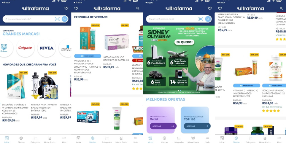
The team installed Microsoft Clarity for their Android app to make sure they were offering the best experience for their app users. They wanted to evaluate the intuitiveness and discoverability of their mobile app’s current design, which heavily relied on slider display buttons containing numerous products and offers by Ultrafarma.

Finding a solution

To determine whether to phase out or continue relying on their slide display button, the team used  Tap Heatmaps, which give them an insider view of the level of impact that their sales messaging and layout had with driving conversions. The Taps Heatmaps helped them answer questions about their users’ initial clicks and the relative frequency of clicks on the slider button compared to other elements on the screen.

By experimenting and analyzing the conversions of two scenarios – one with the slider button and one without – and by understanding the product discovery provided by Clarity’s Mobile SDK heat maps, the team concluded that it would be best to replace the pagination and product display scrolling buttons with infinite scroll, especially on product categories.

For one week, they made a comparison of heat maps to analyze the users’ conversions of their app before and after infinite scroll was implemented. The result was increased user retention, product visibility, and conversion on average by 30%. This change also increased average time spent on the app by 3 minutes which in turn led to higher rate of user engagement. 

Learnings

The team found Microsoft Clarity to be incredibly useful with Ultrafarma’s Android app, in making important business decisions that impacted revenue. Clarity’s features provided a clear picture of the customer journey from the time they visit to when they exit, giving them a visual direction into what areas of improvement they needed to prioritize through session replays and heatmaps.

They learned that even the most prominent app design (slider buttons) that has been there for years can be completely replaced to provide the best customer journey for their users, and to increase their business engagement and conversion KPIs. 

Testimonial

“With Clarity, we sustain a great experimentation culture in our departments of Sales and Marketing, in which important business decisions, with the supervision of our CEO, are made watching real use of our mobile app. No guessing involved or relying on end-of-month revenue total, to measure success. Being able to make changes in time to get back on track and having the opportunity to experiment on the go, is key for making the most out of our traffic sources.”

Leonardo Kuwer Saenz Artioli , Marketing Analyst

Robusta

Robusta

How Robusta Boosted User Engagement with Microsoft Clarity Mobile SDK

What is Robusta?

Robusta is a part of RTG “Robusta Technology Group” and was founded in 2012 to help grow business by introducing customer-facing tech solutions and mobile applications in different technologies.

Robusta provides various services encompassing the full digital product lifecycle. For the past decade, they’ have built over 400 solutions for 230+ companies spanning across all industries in Egypt and surrounding regions. Their solutions have over 7.5 million users and have generated over 55 million dollars in revenue.

As Robusta’s Product Marketing Manager, Abdelrahman ElNaka’s (pictured below) heavily interacts with various analytics and business intelligence tools to thoroughly understand the users and the market’s needs. His focus is always to make data-driven decisions to keep Robusta’s products ahead in the market.

The Challenge

The main question that remained unsolved for Robusta before using Clarity was identifying user behavior patterns that led to low engagement or drops in checkout rates. Especially after releasing new features or new versions of an app, The product team still had low visibility on how well-received those specific features were by the users, making it difficult to optimize the user experience and to understand where the action is happening on their apps.

“we need to understand the ‘why’ and the ‘how’

AbdelRahman ElNaka

Addressing these challenges required Robusta to leverage various analytics and business intelligence tools to gain insights for developing data-driven strategies. Traditional traffic analysis tools still did not give Robusta the ‘why’ behind what was happening. They need to look deeper and understand exactly how users are using their apps.

The Solution

Robusta decided to add Microsoft Clarity into their Android App using Clarity Mobile SDK to improve user behavior tracking, gain deeper insights into user engagement and retention, and identify the underlying reasons behind their checkout cycle drop rate. The team leveraged session replays to understand specific features usage, heatmaps to understand reasons behind low engagement, and customer segmentation to observe behavior across multiple device types and brands.

Actions Taken:

Bug Fixing: Using Clarity, they identified device-specific bugs and various experience problems that were not apparent through quantitative data analytics. Accordingly, they were able to fix these bugs and provide a better experience across all devices. For example, During their testing process, the team uncovered a significant issue with the search function of one of their e-commerce apps that affected Arabic searches. The team discovered that the search algorithm failed to accurately identify the search query for some words. The issue came to light through watching session replays, which led the team to recognize the need for immediate action to rectify the problem and enhance the user experience of their e-commerce app.

Experience Redesign: Robusta also redesigned some of the experiences in their mobile e-commerce apps, rearranged content for the home pages, split the checkout cycle to make it more friendly and optimized for different interaction points in the users’ search behaviors.

Results

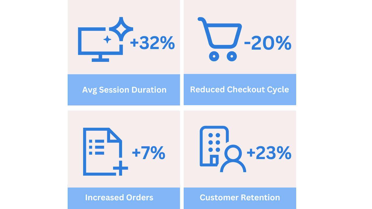
Robusta has found the insights gained from Clarity for mobile apps to be very valuable for understanding their customer behavior which served as a main pillar in driving their data-driven decision-making strategy. They saw a significant improvement in overall user engagement and product value:

Learnings

By using Clarity on their Android apps, Robusta has been able to make informed improvements that enhance user satisfaction and drive business success. Opportunities that they would have missed without using Clarity.

“Microsoft Clarity has become my go-to tool for analyzing user behavior within our mobile apps. Its powerful customer segmentation filters and screen recordings have given me unique insights into how users are interacting with our app, which has helped us make data-driven decisions to improve the user experience. Clarity is now an integral part of our workflow, and I can’t imagine managing our apps without it.”

Abdelrahman ElNaka, PMM of Robusta
Webjuice

Webjuice

How Webjuice increased inbound leads by 30% with Clarity

What is Webjuice?

Webjuice is a reputable digital marketing agency that was founded in 2012 and is headquartered in Dublin. With a global reach, the agency provides top-notch digital marketing services to businesses of all sizes, from small to large corporations, with a particular focus on franchise businesses.

Whether it’s social media, search engine optimization (SEO), pay-per-click (PPC) advertising, or other digital marketing tactics, Webjuice offers comprehensive solutions to help businesses achieve success in the online world.

Michal Barus is the founder of Webjuice (pictured below) where he has worked for the past 13 years. Michal has a background as a developer, SEO, and business development.

The Challenge

Webjuice is a digital marketing agency, that is continuously seeking out innovative methods to either boost revenue per visitor or reduce traffic costs. However, they encountered challenges such as low conversion rates and average order value. To gain a comprehensive understanding of what was happening on their website, they required a visual user behavior tool – conventional analytics failed to provide valuable insights.

As a solution, they turned to Clarity to diagnose and address these issues. Let’s explore the outcome of their efforts.

Why Did They Use Microsoft Clarity?

Microsoft Clarity is a great tool for getting an idea of user behavior, such as clicks, scroll depth, and mouse movements. It had several benefits for analyzing and optimizing their content, website, conversion rate, and page performance.

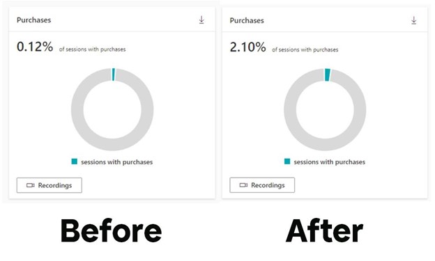
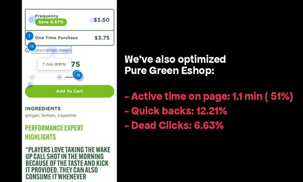
Microsoft Clarity is a powerful tool that can help you optimize your website’s performance and user experience, leading to improved engagement, conversions, and business success. Using Microsoft Clarity, Webjuice increased Puregreen shop’s organic purchase rate to 2.10%. Before, it was below 0.10%.

Webjuice Wanted to Increase User Engagement & On-Page Time:

Webjuice internal team always creates high-quality and helpful content, but sometimes they faced several issues with converting visitors to customers. They struggled to discover issues from their end and couldn’t find the proper solution. They tried several tools, but none worked quite as well as Microsoft Clarity that gave them the opportunity to optimize their webpage.

They have changed their CTA, content structure, and banner. After changing several items, they were able to optimize their conversion and sales rate.

Finding A Solution:

Webjuice always thinks about their clients and puts its business first. Thus, they must design and create layouts that still look professional while fitting all screens.

To enhance the overall customer experience, the company created a comprehensive model of the traffic funnel by analyzing the customer journey map. During this process, they discovered a significant drop-off rate after potential customers clicked on the sign-up button, as many failed to complete the sign-up process. While the post-sign-up experience was favorable and had a higher conversion rate, the initial sign-up conversion rate fell short of their expectations.

Overall, by taking steps to improve the sign-up process and better understand the needs of its customers, the company increased the conversion rate and ultimately provided a more positive customer experience.

Inbound leads increased by 30% with session recordings and heatmaps, also by visualizing pain points for their customers within their UX design.

After getting the proper data and insights, their design and development team could better understand why they were not able to encourage users to take actions. They repositioned the CTA button and added a lead form to get more subscribers. They also repositioned the purchase button for better engagement.

The Results:

After using Microsoft Clarity, they were able to increase engagement between 5% to 30% on several projects. Clarity helps us target better SEO in Dublin. They discovered the following after using Clarity:

  1. Do not ignore small changes.
  2. Do not be afraid of A/B testing.
  3. Make a decision with proper data.
  4. Observe your users.

Users interacted with their website. With no data limitations or pricing tiers they increased their inbound leads by 30% with session recordings and heatmaps, by visualizing pain points for their customers within their UX design.

“Clarity is an exceptional tool that is imperative for websites that seek to optimize sales and conversions. Its comprehensive and intuitive features make it an indispensable asset for businesses. The tool is particularly remarkable as it is freely available, providing functionality that is typically available only with premium tools.”

-Michal Barus, CEO of Webjuice