How AllEvents Uses Microsoft Clarity to Optimize Experiences for 20M+ Users
When rapid growth revealed hidden friction in their digital experiences, AllEvents turned to Microsoft Clarity to uncover the “why” behind user behavior — turning insights into impactful product decisions.
About AllEvents
AllEvents is an online platform that helps users discover events, activities, and things to do in cities around the world. It was founded in 2011 by Amit Panchal and Ruchit Patel with a simple but ambitious mission: to make event discovery effortless.
Over the years, the platform has grown into a global product operating in more than 20 countries, connecting over 20 million users with events they care about. Its mobile app has surpassed 2 million downloads — becoming a go-to solution for people looking to explore what’s happening nearby.
But as AllEvents expanded its reach, new challenges began to emerge — especially when it came to optimizing user experience at scale.
To solve this problem, Paras Makhija, the B2C growth strategist at AllEvents, decided to dig deeper than surface-level metrics and see what was really going on.
The Challenge
AllEvents’ rapid growth brought scale — but it also brought complexity. With over 10 million active users across both web and mobile platforms, understanding how users actually interact with the product became increasingly difficult.
As the team rolled out new features, they found they could measure what users were doing, but not why they were doing it. This made it hard to validate features, understand drop-offs, or learn what was working — especially with such a large and diverse global audience.
“We needed to know: Were users finding value? Where were they struggling? What was going unseen?”
Paras Makhija, B2C Growth Strategist, AllEvents
Several pain points stood out:
- High bounce rates on the website: Many users were dropping off within the first 10 seconds — even on landing pages that were highly targeted and strategically designed to convert.
- App homepage drop-offs: Many users weren’t progressing beyond the app’s homepage. They weren’t tapping into event categories, listings, or recommendations. This raised a red flag about potential issues with discoverability or relevance.
- Low engagement during A/B testing: Features the team believed would increase engagement — such as new navigation elements or CTAs — sometimes produced ambiguous or underwhelming results.
Traditional analytics tools, with metrics like page views and bounce rates, were able to highlight what was happening on the surface. But with a global user base spanning a wide range of behaviors, cultures, and preferences, Makhija and his team needed something that could go deeper — helping them see the real reasons behind user behavior.
That’s when they adopted Microsoft Clarity.
The Solution
AllEvents integrated Microsoft Clarity into their website and used the Clarity Flutter SDK to bring the same behavioral insights into their mobile app. This allowed the team to capture a unified view of user interactions across both platforms.
Clarity quickly became central to AllEvents’ product decision-making process. Its session recordings, heatmaps, and insights gave the team a clearer view into the user journey — allowing them to validate hypotheses, identify friction points, and build with more confidence.
“We needed to see things from the user’s perspective — clicks, hesitations, rage taps, scroll depth — all within context. That’s where Clarity’s visual insights changed the game,” said Makhija.
With Clarity, the team was able to uncover several key insights that challenged their assumptions and led to real product improvements.
On the Website
- Heatmaps and recordings exposed unexpected user behavior: Users were consistently attempting to click on or download event banners — even though these weren’t designed to be interactive. This suggested untapped engagement potential.
- The “View Map” feature emerged as surprisingly important: While the team initially believed the event map was rarely used, Clarity showed it was actually one of the most clicked elements on the page. This insight flipped internal assumptions and showed the potential for a more prominent map experience.
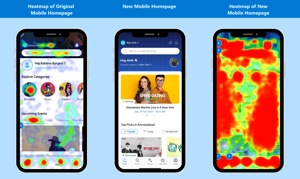
In the Mobile App
- Session recordings revealed confusion and disorientation: Users scrolled the mobile homepage with hesitation, missed key CTAs, and bounced quickly. What initially looked like a content problem turned out to be an issue of personalization.
- The homepage lacked relevance for both new and returning users: Without contextual or personalized content, users didn’t feel guided or engaged. Clarity helped the team recognize this as a major opportunity for improvement.
Across Global Markets
- Geo-specific behavioral analysis uncovered cultural UX differences: With users in more than 20 countries, the team needed to understand how behaviors varied by region. Clarity enabled analysis of sessions tied to specific user IDs and geographic segments, allowing for localized hypotheses and region-specific design experiments.
“Watching real users interact with our platform — in all their scrolls, pauses, rage taps, and exits — helped us identify friction points that numbers alone couldn’t surface.”
Paras Makhija
What They Changed
Clarity’s insights led AllEvents to make several high-impact changes across their digital experience:
Event Banner Interaction Enhancements
Heatmaps and session replays showed that the event banner on listing pages had the second-highest click volume — despite having no interactive features. This revealed a major missed opportunity. In response, the team:
- Enabled banner zoom/enlarge functionality.
- Allowed users to save, share, or RSVP directly from the banner.
This small UX change led to a meaningful boost in engagement, with users actively sharing events — effectively turning each banner into a lightweight branding asset.
Map Feature Optimization + New Revenue Stream
Data from Clarity revealed that the “View Map” button was the third-most clicked element on event pages. Contrary to assumptions, users wanted to see — and interact with — event locations. The team responded by:
- Making the map more prominent.
- Adding contextual actions like RSVP and Share within the map view.
They also took it one step further: when they noticed rising user interest in nearby accommodations, they integrated Stay22 Maps, allowing users to explore and book nearby hotels directly. This created a better experience for users and a brand-new, organic revenue stream for AllEvents.
App Homepage Redesign & Personalization
The session recordings made it clear that the app homepage wasn’t connecting with users. In particular, the lack of personalization was causing confusion and quick exits.
To address this, AllEvents rolled out a complete homepage overhaul, with key new features:
- Dynamic greetings that change each time the app is opened.
- Happening Vibes — Instagram-style stories that highlight trending events.
- Top Picks For You — personalized suggestions based on user behavior.
- Social Discovery — tools to find events friends are attending.
These features collectively added relevance, delight, and structure — giving users stronger reasons to engage and explore.
The Results
After implementing the changes informed by Clarity, AllEvents saw immediate, measurable improvements across both web and mobile.
Website
- Over 10,000 event banner downloads in the first month after launch — transforming a static asset into a powerful tool for organic event promotion.
- The map interaction redesign led to increased engagement and enabled the Stay22 integration, opening a new monetization stream.
- The addition of a Share button contributed to 5% of all RSVPs.
- Overall RSVP conversions from event pages jumped by 10%.
Mobile App
- Happening Vibes (Stories) generated 6,000+ views in just 15 days, increasing content discovery and session duration.
- Homepage-to-event navigation improved by 10%, strengthening a key user journey.
- User feedback reflected the impact — app reviews and ratings pointed to increased satisfaction and appreciation for the new, personalized experience.
“Clarity helped bring our users’ experiences into focus, and we turned those learnings into product decisions that made our platform more engaging, more usable, and more loved.”
Paras Makhija
Conclusion
Clarity didn’t just help AllEvents identify product issues — it helped them uncover growth opportunities. It gave them a clear view into real user behavior and provided the insights needed to act quickly and effectively. For Makhija and the team, Clarity is now part of their daily workflow.
“We don’t just check Clarity — we binge-watch it,” Makhija said. “It’s like Netflix for product people: every session tells a story, and every rage click is a plot twist. It’s simple, powerful, and honestly… kind of addictive.”
By combining user empathy with hard data, AllEvents continues to grow as a global platform — delivering relevant, intuitive, and engaging experiences for millions of users around the world.